Fraud detection · Web · Startup · Crypto

Enhancing fraud detection with data visualization.

Enhancing fraud detection with data visualization.

Enhancing fraud detection with data visualization.

Doubled daily task completion rates for 25 internal risk analysts at Binance, increasing suspicious money inspection cases per analyst from 10 to 20 per day by designing an interactive data visualization tool that streamlined the table-based fraud detection system.
Role

End-to-end design

End-to-end design

Timeline

3 months

3 months

Team

1 PM, 1 designer, 5 developers

1 PM, 1 designer, 5 developers

The challenge

Why this is a challenge

Why this is a challenge

The risk team had to manually record data and draw connections to spot fraud among Binance users, because their interface presented everything in an inefficient table format.

The solution

Our solution to the issue

Our solution to the issue

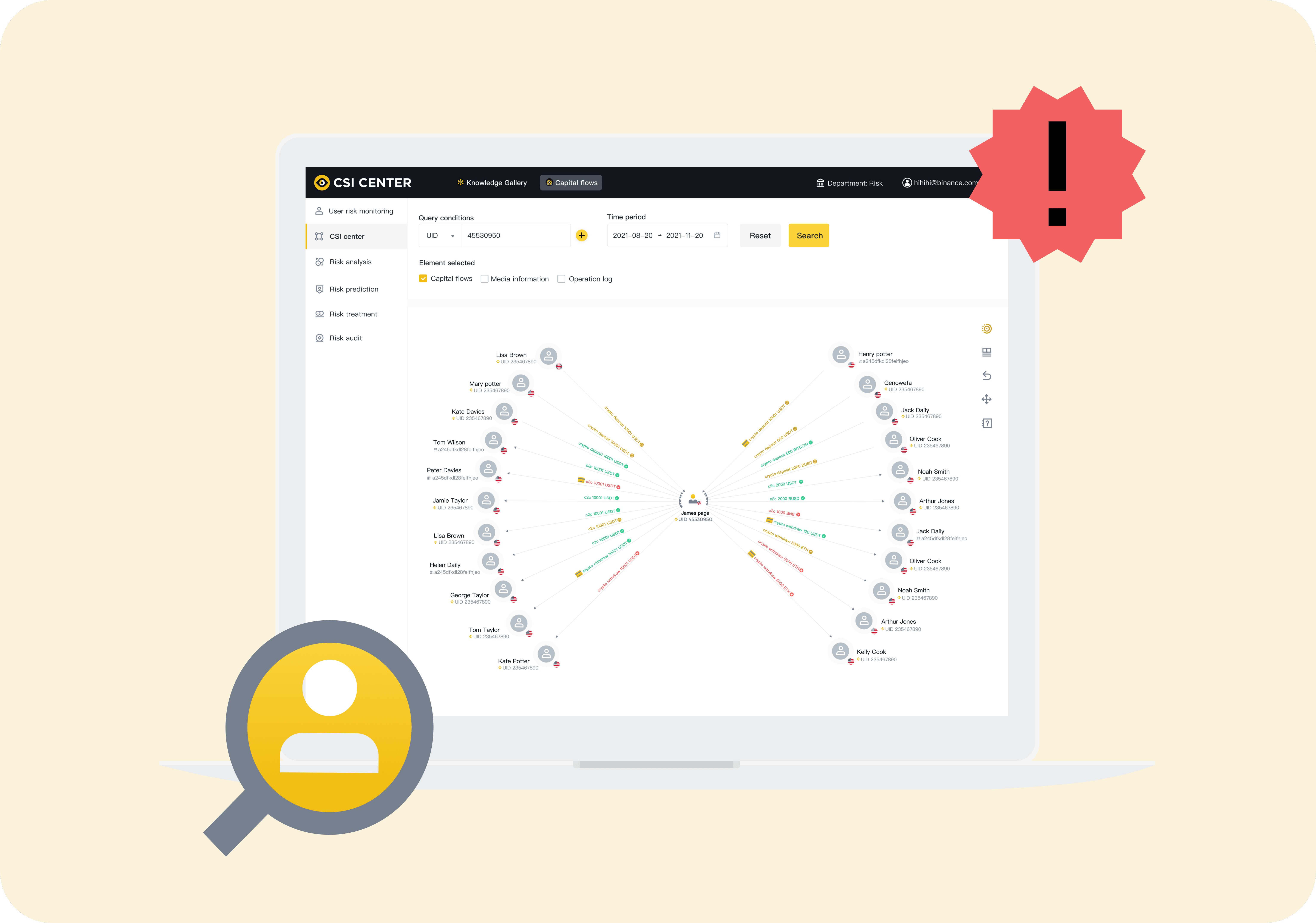
Created a data visualization tool that boosted risk analysts’ task completion rate by 2x and indirectly boosted customer satisfaction and engagement. Before diving into my design process, here’s a direct comparison of the redesign.

Context

So what is Binance’s fraud detection system?

So what is Binance’s fraud detection system?

So what is Binance’s fraud detection system?

Due to rising crypto fraud, Binance formed a risk team to investigate suspicious transactions. Customers can report issues, and analysts use fraud detection tools to review transaction histories and track funds.

Due to rising crypto fraud, Binance formed a risk team to investigate suspicious transactions. Customers can report issues, and analysts use fraud detection tools to review transaction histories and track funds.

Redesign comparison

Before

Before

Before

This list view presents detailed data for each item, but the trade-off is that comparing relationships between entries is difficult, and finding specific data means scrolling a long table.

After

A diagram that shows how money moves.

A diagram that shows how money moves.

A diagram that shows how money moves.

The diagram uses a center-outward layout for easy navigation, with expandable and collapsible elements to display hierarchical data. Icons highlight each transaction’s status, helping analysts quickly locate and identify the data.

Research

Analysts want to quickly locate and identify information.

Analysts want to quickly locate and identify information.

Analysts want to quickly locate and identify information.

To uncover risk analysts’ pain points, I conducted 25 internal interviews and found that they need faster ways to locate and identify information.

Peter Wang

Binance risk analyst for 3 years

Brief

“I’m highly frustrated with the current data analysis platform.”

“I’m highly frustrated with the current data analysis platform.”

Job to be done

When analyzing data, I want a tool that quickly locates and identifies information, so I can efficiently separate queries and sort flow direction.

Users were also frustrated with manually sorting data when investigating suspicious transactions in the old system.

Users were also frustrated with manually sorting data when investigating suspicious transactions in the old system.

Findings

Three pain points kept coming up.

Three pain points kept coming up.

Three pain points kept coming up.

After interviewing, I focused on the three key pain points analysts highlighted most often with the current table-based tool.

After interviewing, I focused on the three key pain points analysts highlighted most often with the current table-based tool.

Unclear asset flows in theft cases

Lack of clarity when investigating user asset flows in theft cases.

Hard to compare data across columns

Queries had to be divided across multiple modules.

Manual effort to identify downstream counterparties

Identifying downstream counterparties took a lot of manual work.

Goal

Increase daily case inspections by 1.5x.

Increase daily case inspections by 1.5x.

Increase daily case inspections by 1.5x.

Our goal was to increase Binance’s daily case inspection rate by 1.5x, helping retain customers through stronger support for hacked funds and suspicious transactions.

Our goal was to increase Binance’s daily case inspection rate by 1.5x, helping retain customers through stronger support for hacked funds and suspicious transactions.

How might we

“How might we help risk analysts locate and identify data, so they can complete their daily suspicious money inspections more efficiently?”

“How might we help risk analysts locate and identify data, so they can complete their daily suspicious money inspections more efficiently?”

“How might we help risk analysts locate and identify data, so they can complete their daily suspicious money inspections more efficiently?”

Ideation

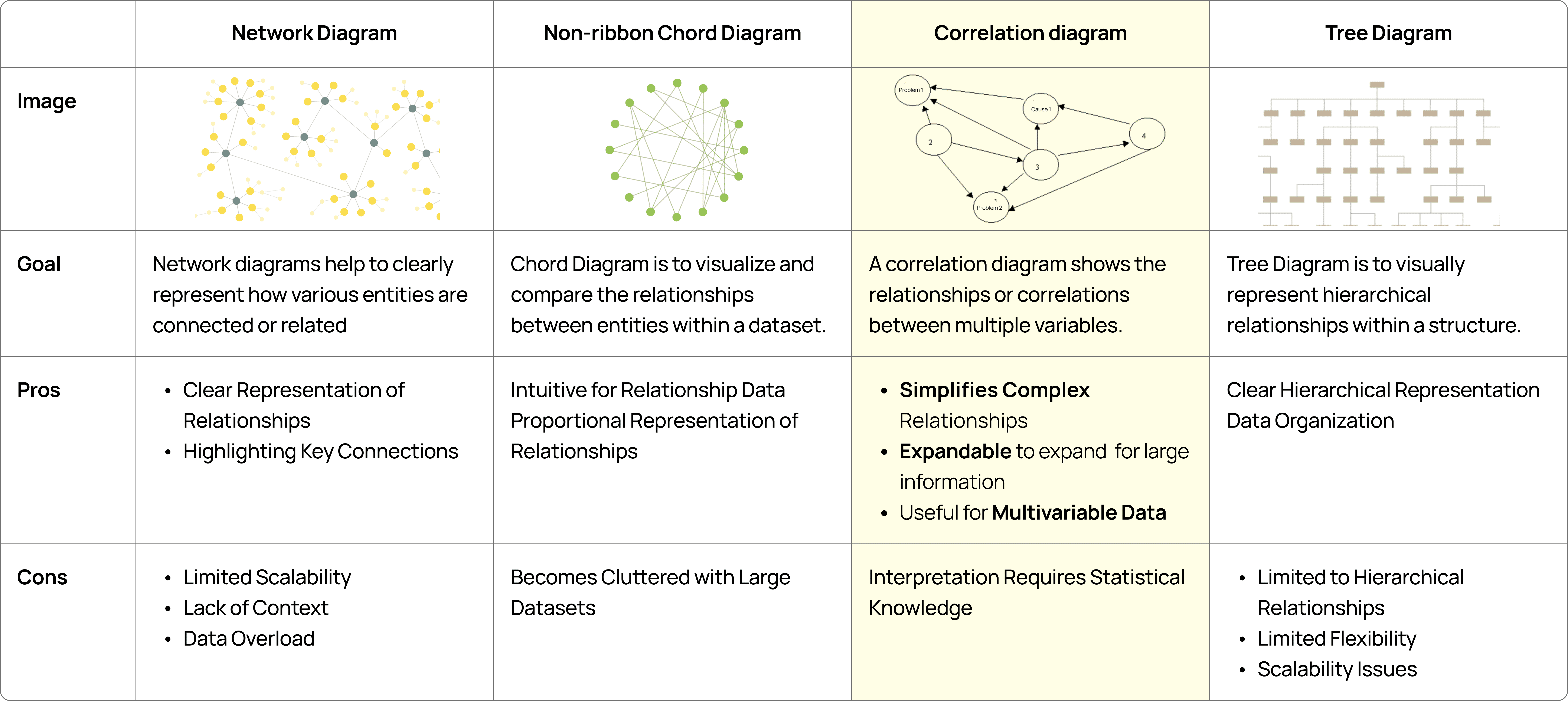
Inspired by correlation diagrams and progressive disclosure.

Inspired by correlation diagrams and progressive disclosure.

Inspired by correlation diagrams and progressive disclosure.

I was inspired by correlation diagrams, dot-connecting patterns, and the concept of progressive disclosure.

I was inspired by correlation diagrams, dot-connecting patterns, and the concept of progressive disclosure.

First iteration

Data linked to relevant information.

Data linked to relevant information.

Data linked to relevant information.

My initial design linked each piece of data to its relevant information. However, users struggled with navigation.

2/25

2/25

found the data relationships clear

1/25

1/25

found the hierarchy clear

3/25

3/25

found navigation clear

4/25

4/25

found the context clear

1/25

1/25

found it easy to scale

Second iteration

A progressive, direction-oriented view.

A progressive, direction-oriented view.

A progressive, direction-oriented view.

Users needed a diagram that clearly displays data hierarchy and is easy to explore with large datasets. I revisited my research and built on the correlation diagram, using a progressive view for complex hierarchies and arrows to show transaction direction.
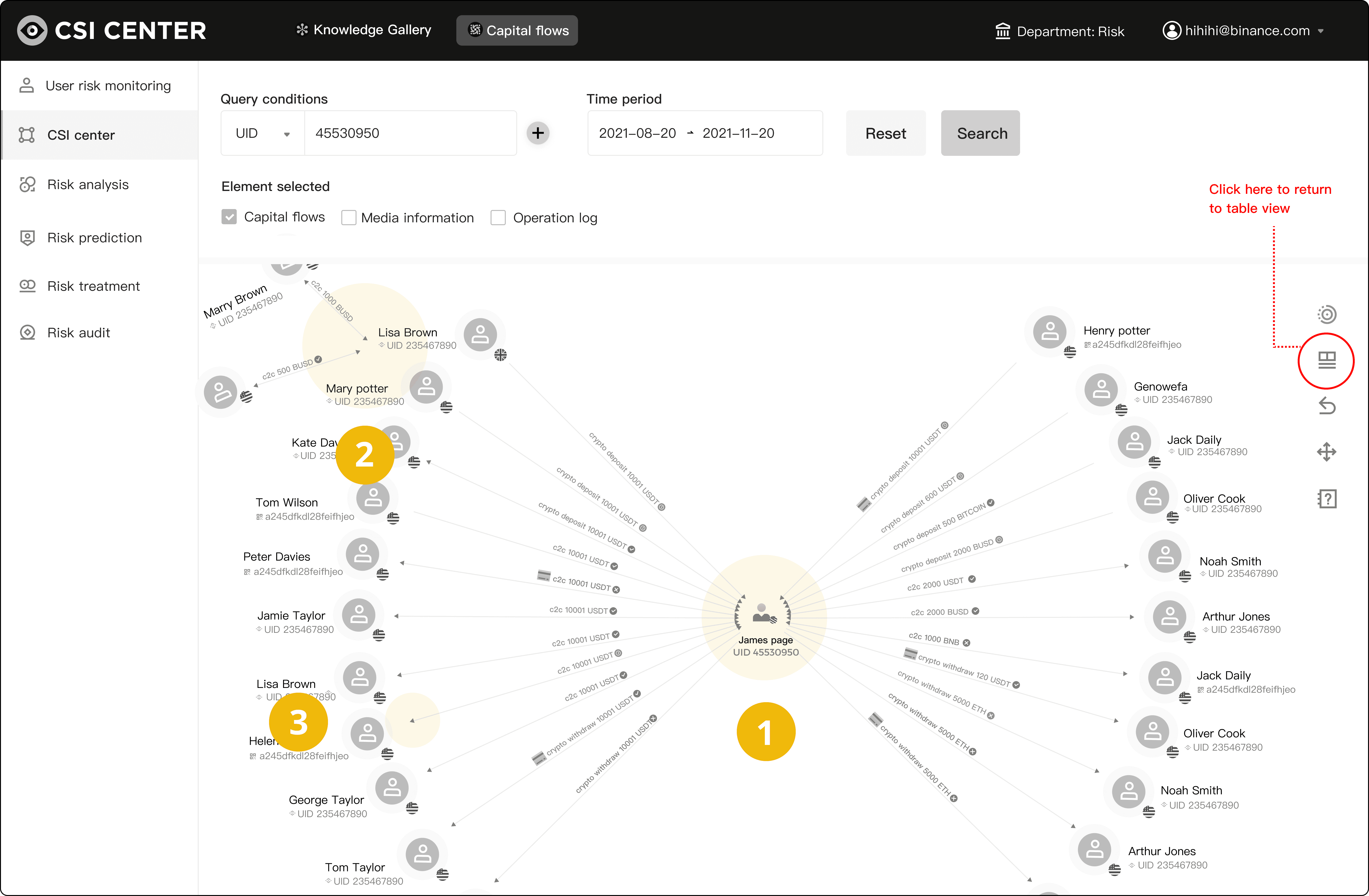
Easy to explore

Starts from the center and expands outward, so people can find their way easily.

Easy to navigate complex datasets

Expand and collapse to display hierarchical data.

Arrows and icons

Show each transaction’s status and direction: deposit, withdrawal, or C2C.

Visual design

Color that follows the data hierarchy.

Color that follows the data hierarchy.

Color that follows the data hierarchy.

After the redesign, I ran a usability test with the same 25 users and reached an average score of 92%, an improvement over the previous benchmarks. After aligning with the PM and developers, I moved on to the diagram’s UI.

After the redesign, I ran a usability test with the same 25 users and reached an average score of 92%, an improvement over the previous benchmarks. After aligning with the PM and developers, I moved on to the diagram’s UI.

92%

92%

92%

Average usability score (23/25)

Up from the first iteration, where no more than 4 of 25 users found any aspect of the diagram clear.

From the first to the final version (left to right), I made color decisions based on insights from the PM. The data hierarchy is transaction status, then transaction direction, then counterparty user, and I highlighted colors in that order, which led to positive feedback from users.

Prototype

One prototype to align the team and train analysts.

One prototype to align the team and train analysts.

One prototype to align the team and train analysts.

I created prototypes to align developers and the PM, and to train internal analysts to use the new tool.

I created prototypes to align developers and the PM, and to train internal analysts to use the new tool.

Impact

Twice the cases. Happier customers.

Twice the cases. Happier customers.

Twice the cases. Happier customers.

After three months with the risk team, daily case investigation completion doubled, surpassing the 1.5x KPI, and Binance users who reported to the risk team gave positive satisfaction survey results.

Binance internal analysts

2x

2x

2x

Passed the 1.5x KPI

Increase in daily case investigation completion

Internal analysts boosted daily case investigations from 10 to 20, reducing labor costs and enabling the team to focus on higher-priority tasks.

Binance customers

1.8x

1.8x

1.8x

Rise in NPS satisfaction survey scores

Binance users reporting to the risk team increased their satisfaction from 50 to 90, according to the NPS survey.

Reflection

Challenge and reflection

Challenge and reflection

Challenge and reflection

The challenge

We initially struggled with complex design requirements, and the development team had difficulty achieving the ideal data shape.

The approach

I shared the user testing results with the team and led the research, collaborating with the PM and developers to create an effective diagram formula.

The result

This met user needs and empowered the team to tackle technical challenges. The implementation resulted in a 3x increase in internal work efficiency.
More projects

More projects

More projects

Designed and built by Karina Su @2026