Seven steps became three.

I redesigned Jobscan's AI LinkedIn optimizer and built its design system. Sign-ups rose 41%. Conversions rose 28%.
From download-and-upload to one click.

Several windows and a PDF round-trip.

One guided flow, right on the page.
A million job seekers. One confusing flow.
Jobscan's AI suggests keywords and formatting that help LinkedIn profiles get noticed. But confusing steps kept users from becoming paying customers.
Listening first.
120 Trustpilot reviews, guerrilla tests with 7 users and 15 interviews.


Three problems to solve.
Multiple windows and a file round-trip.
Irrelevant content buried the task.
Unclear hierarchy, inconsistent components.
How might we make LinkedIn optimization feel effortless?
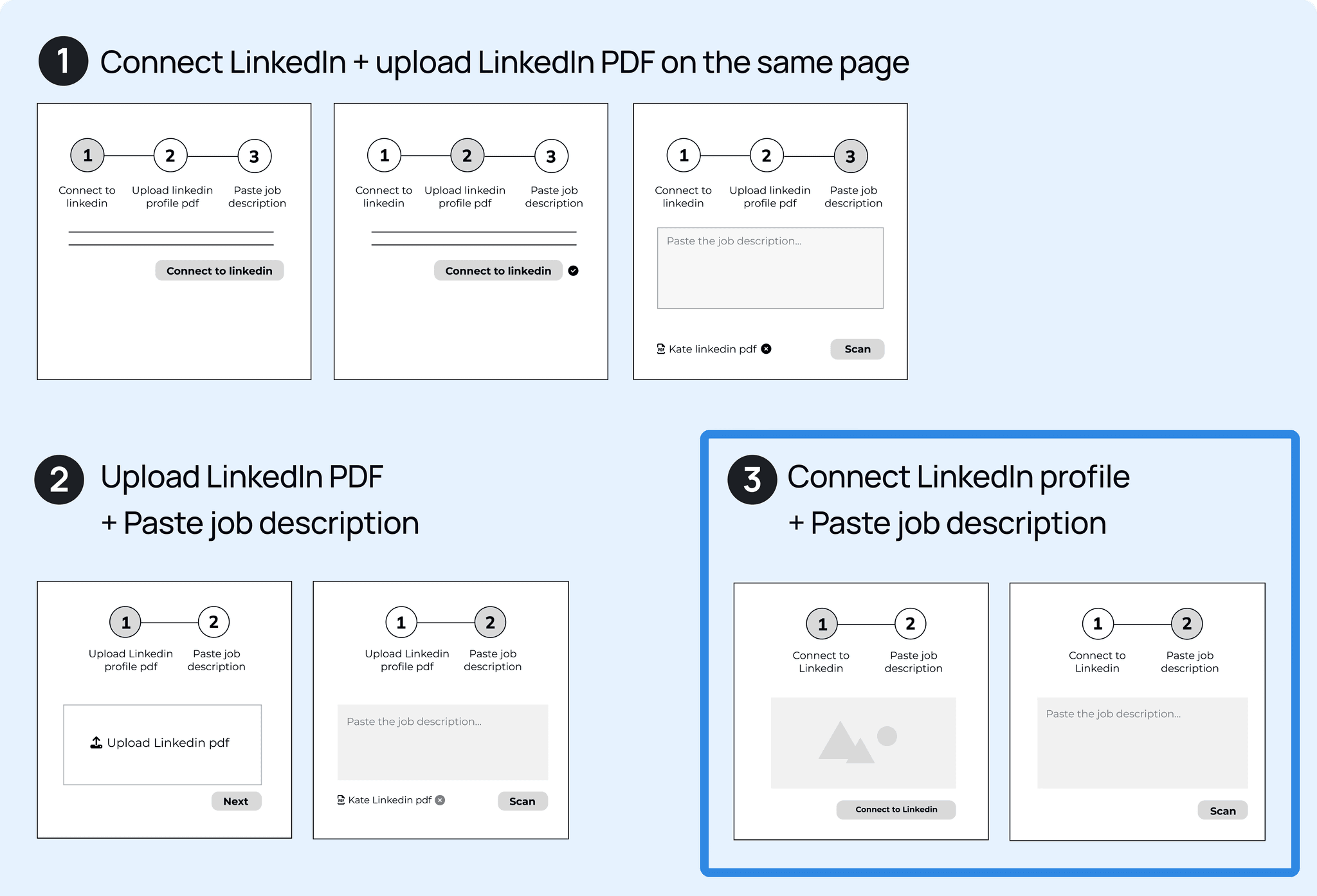
Seven redundant steps became three.
5 wireframes, 20 users. The third idea won for its simplicity.

Built from scratch.
Open Sans, a clear color scale and reusable components, ready for developers.

Clear steps. Less noise.

Vague instructions and a redundant upload.

Progress, one-click connect and helpful tips.

Extra content pulled focus.

Key tasks first, 3 steps down to 2.

A small flow. A big result.
One month after launch.
Monthly sign-up rate.
Subscriber conversion rate.
The core optimization flow.
Evidence wins the room.
The PM first said no. User testing results and a working session with PM and developers turned it around, and we shipped the idea users voted for.

