
#Web
#Startup
#Crypto
Redesigned Internal Risk Tool to Improve
Work Efficiency
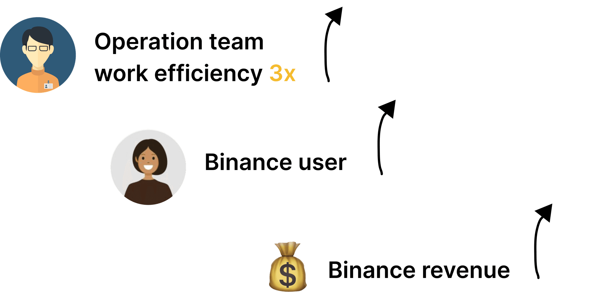
The project improved internal workers' task completion rate by 3x and operational effectiveness through user testing and continuous iteration of the Binance fraud detection tool. I conducted user research, revamped the visualization tool, and developed an enterprised design system.

End to end design
3 months
1 PM, 1 designer, 5 dev
The problem
The Risk Team's had to manually record data and draw connections to spot fraud among Binance users due to an inefficient table format of their interface.
The solution
Created a data visualization tool that boosted risk analysts's task completion rate by 3x and indirectly boost customer satisfaction and engagement. Before diving into my design process, here’s a direct comparison of the redesign.

Before

Problem
The table format makes cross-data comparison difficult and does not clearly illustrate relationships between data points.

After

Solution
The correlation diagram uses arrows to clearly show data relationships and allows expansion and collapse for easy navigation of complex data.
So what is Binance fraud detection system?
Due to rising crypto fraud, Binance formed a risk team to investigate suspicious transactions. Cutomers can report issues, and analysts will use fraud detection tools to review transaction histories and track funds.
In order to understand users, I did 10 user interview in risk team and developed a "Job to Be Done" to better understand their goals and needs…

Pain points at the current workflow

Findings
After interviewing, I focused on the three key pain points most frequently highlighted by analysts with the current table format tool.
1
Unclear asset flows in theft cases
Lack of clarity when investigating user asset flows in theft cases.
2
Difficulty comparing data from cross columns
Difficulty from the need to divide queries across multiple modules.
3
Manual Effort in Identifying Downstream Counterparties
Difficulty from the manual effort needed to identify downstream counterparties.
How might we help internal risk analysts complete their tasks in one day by analyzing the relationships between data in a visual way?
Research diagram to explore potential solutions

Gain insights from expandable multivariable correlation diagrams, applying them to design with four key takeaways

Design iteration
Version 1

1
All data at a glance
Reduce steps to see all
2
No specific navigate direction
Easy to lose tracking
Version 2

Idea 1
1
Center outward
Easy to track data from center
2
Progressive Disclosure
Complex data is scalable
3
Easy to navigate
Data spread from left to right
User test results
After testing, version 2 was preferred for efficiency and intuitiveness, so we'll proceed with it.

Iterations of version 2

Design improvement

Create prototypes to align developers & PM and train risk analysts

Conclusion
Challenge & reflection
We initially struggled with complex design requirements, and the development team had difficulty achieving the ideal data shape.
To overcome this, I shared the user testing results with the team and led the effort to research and collaborate with the PM and developers to create an effective diagram formula.
This approach not only met user needs but also empowered the team to tackle technical challenges. The successful implementation resulted in a 3x increase in internal work efficiency.
More projects


Designed and built by Kathy Su @2024 | Best view in desktop