
Brief
Jobscan, an AI-driven resume platform with over a million users, experienced a low conversion rate.
Problem
Through user research, we discovered the problems of low discoverability, inconsistency, and inefficiency. The confusing and difficult navigation deterred users from converting to paying customers.
Task
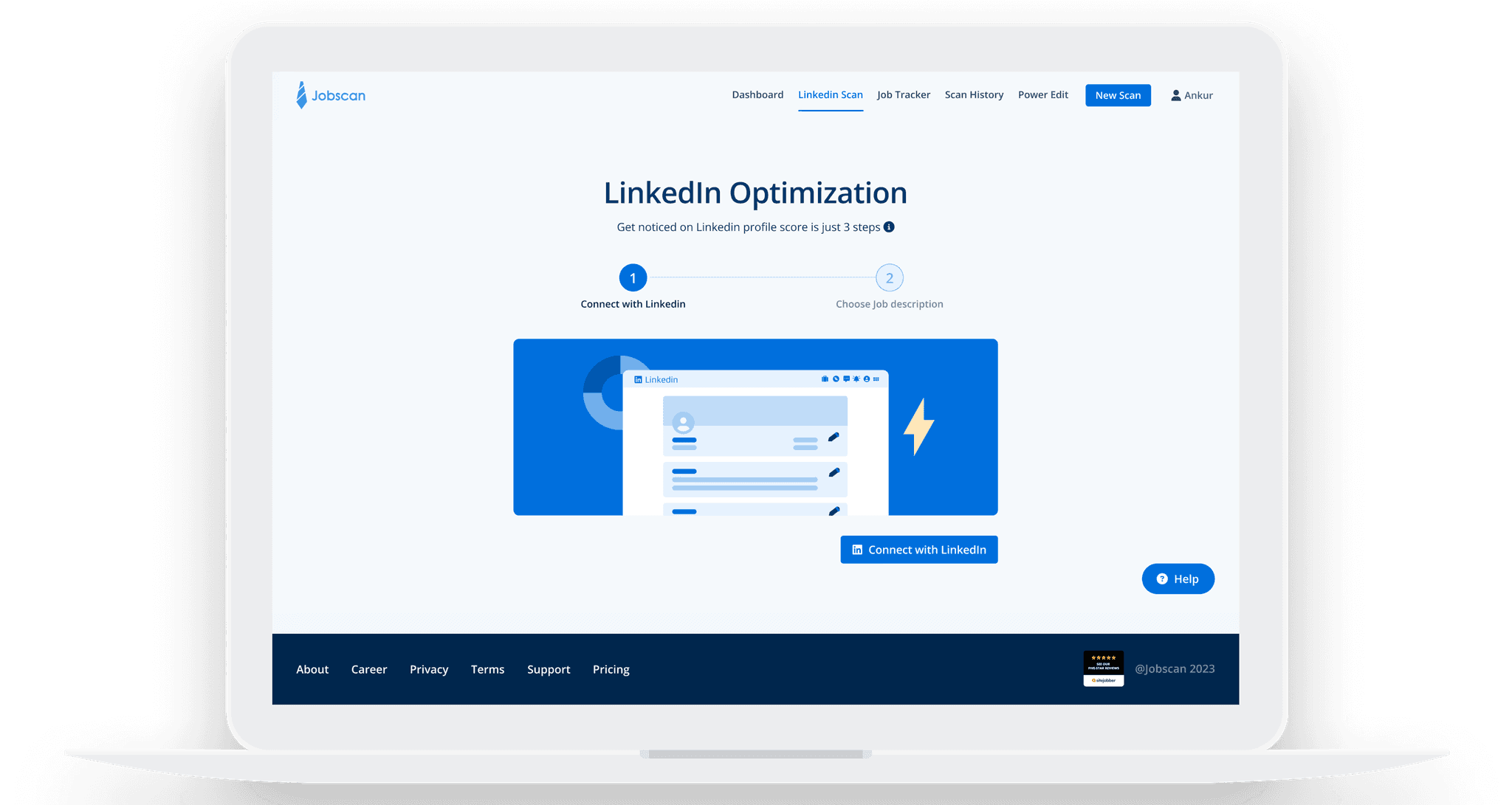
Streamline Jobscan's LinkedIn optimization feature and revamp the interface visuals.
Outcome
40% increase in the signup rate and 30% rise in the conversion rate

Some quotes from users…
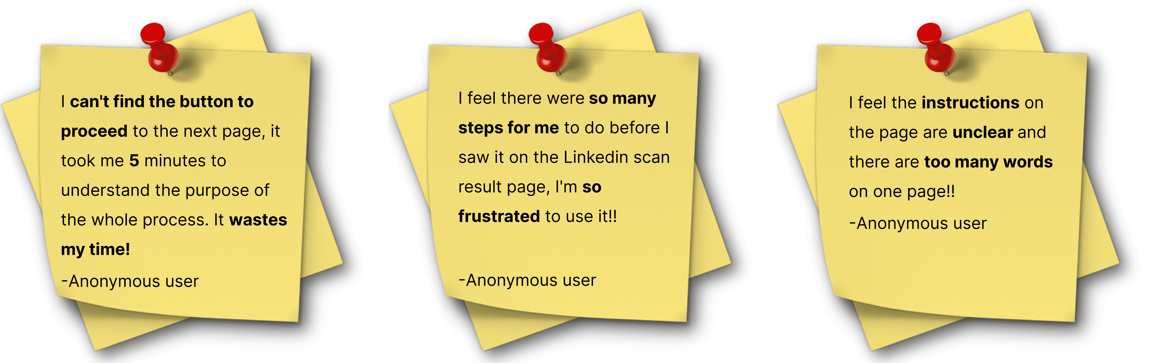
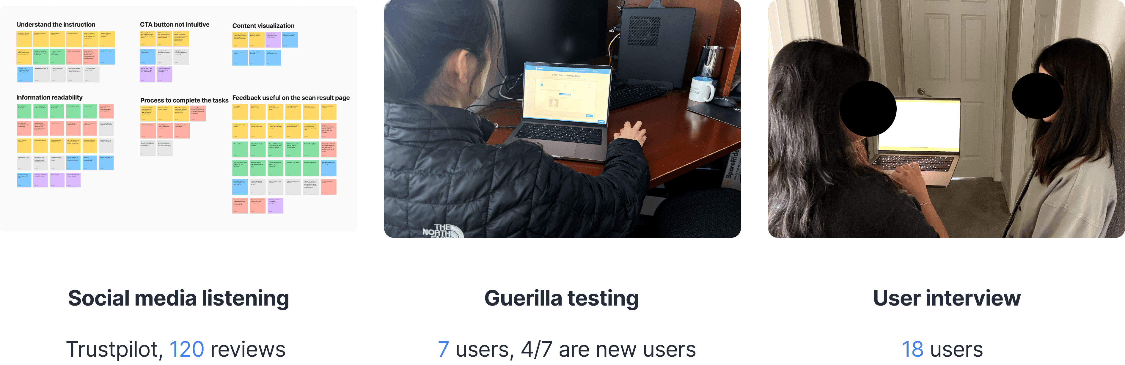
Base on the previous research on user feedback online and guerrilla usability testing, here are the 3 problems I decided to focus on:
1
Not intuitive/ not efficient
too many clicks and steps to complete the tasks the steps includes open multiple windows and download and upload a file
2
Poor discoverability
Not relevant information on the page Information overloaded
3
Poor readability
Font hierarchy is not clear Inconsistent color and component
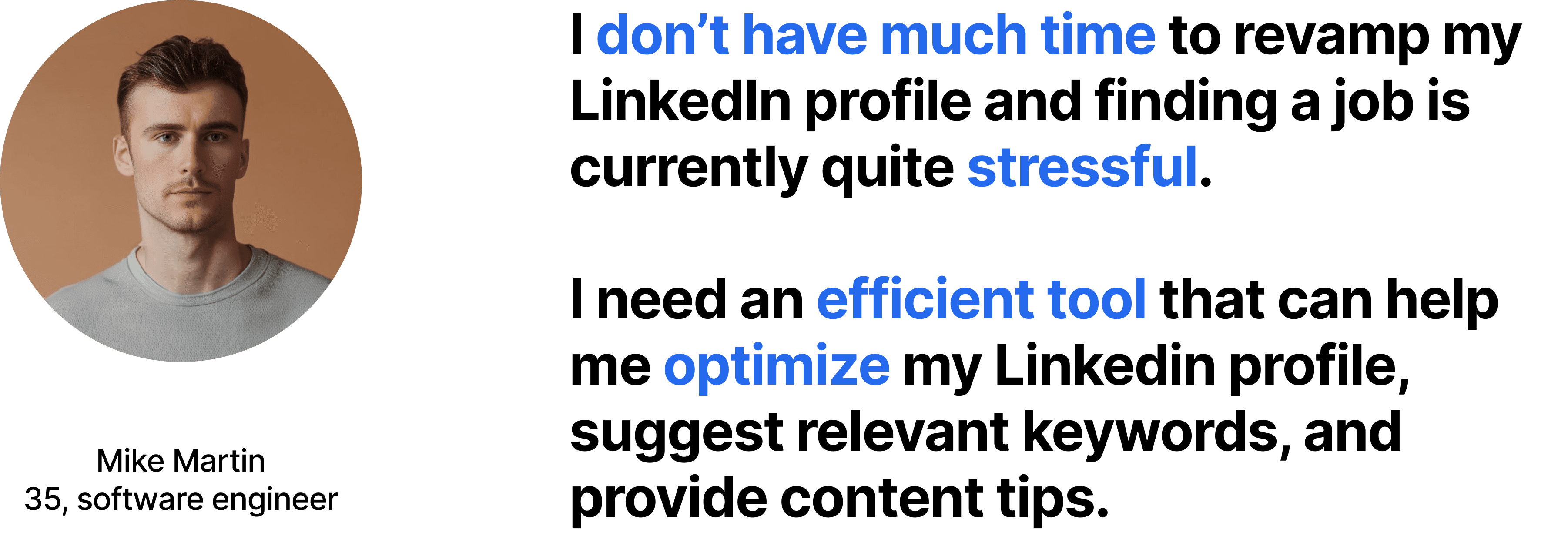
Users indicated that the current process for scanning LinkedIn profiles was burdensome. They needed to complete 7 steps, involving three different windows.
I considered whether there were other ways to complete the same tasks, noting that the steps within the dark blue box seemed redundant.

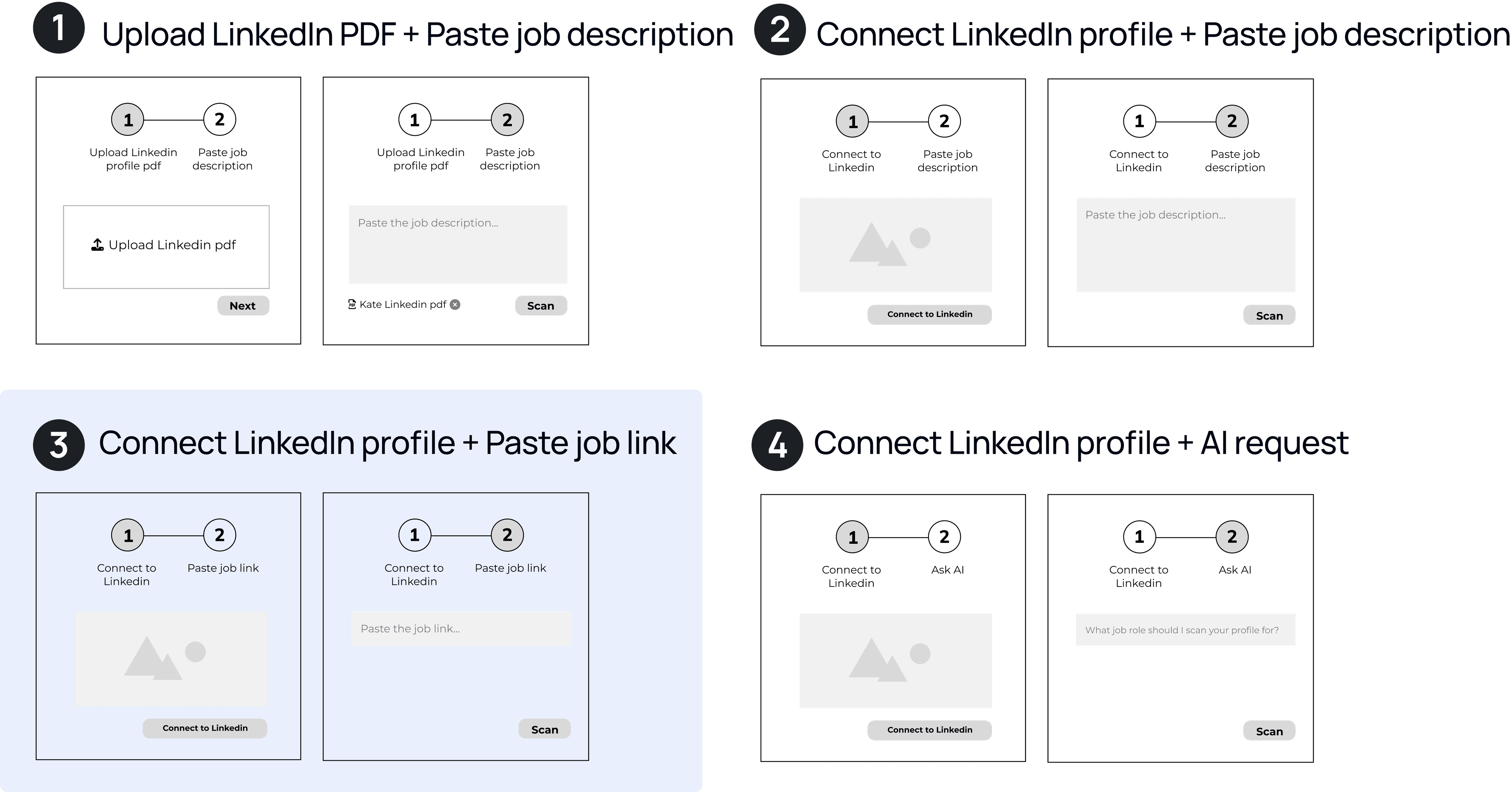
To understand the new ideas and address user pain points, we conducted 5 user tests on 4 wireframes. The third idea user copying the job description page link is the most intuitive solution and this approach received the highest votes from users, so we decided to proceed with it.
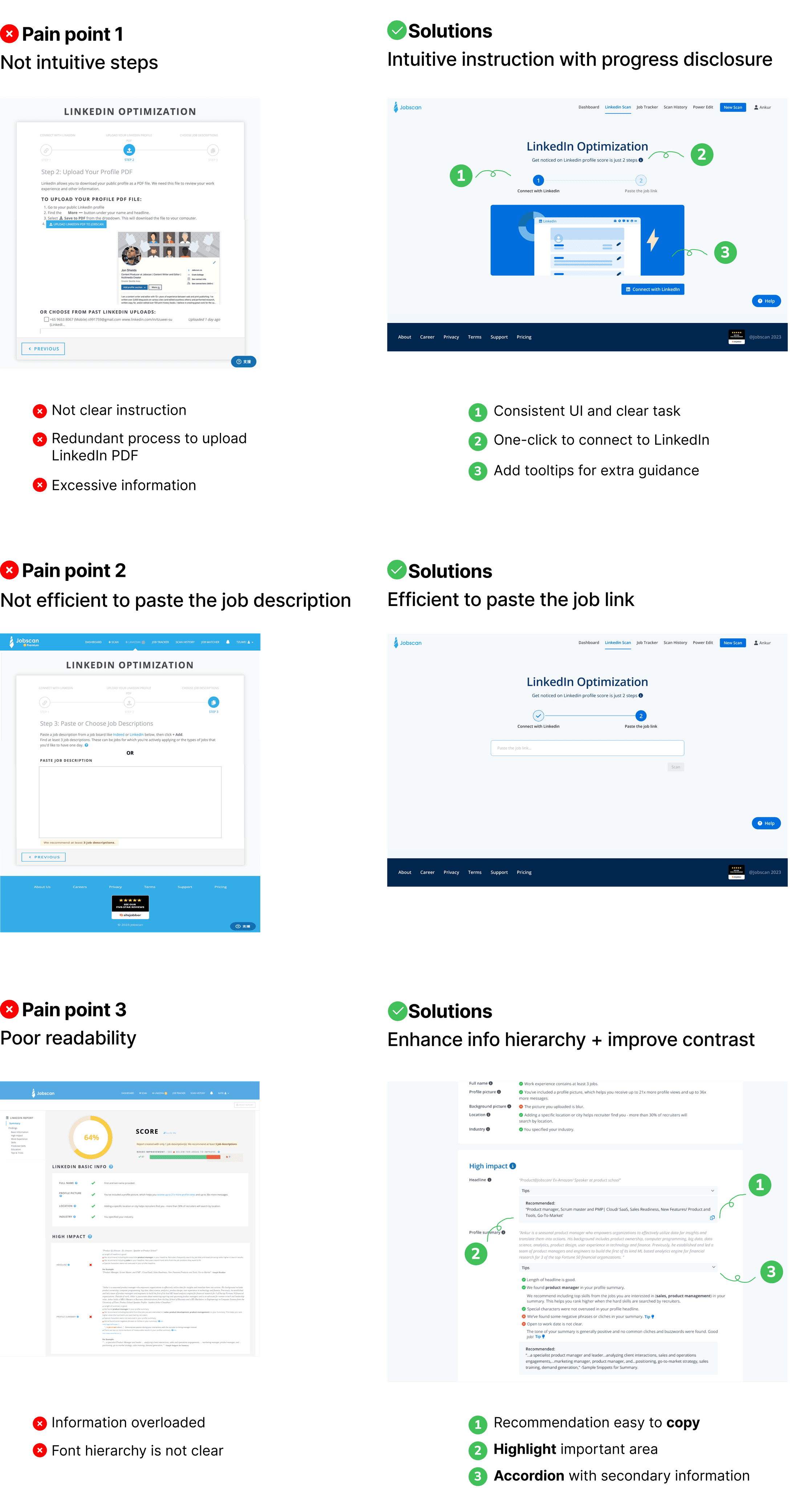
The clickable prototype was shared with seven of the same users who previously assisted with the guerrilla usability testing. The user testing showed that it was:
1
Intuitive/ efficient
Easy to understand the instruction to complete tasks (7/7) Completed the tasks in 2 mins (7/7)
2
Discoverability
Easy to find the CTA button (6/7) Easy to understand the information on the scan results page (7/7)
3
Readability
Improved Comprehension and better engagement(7/7)
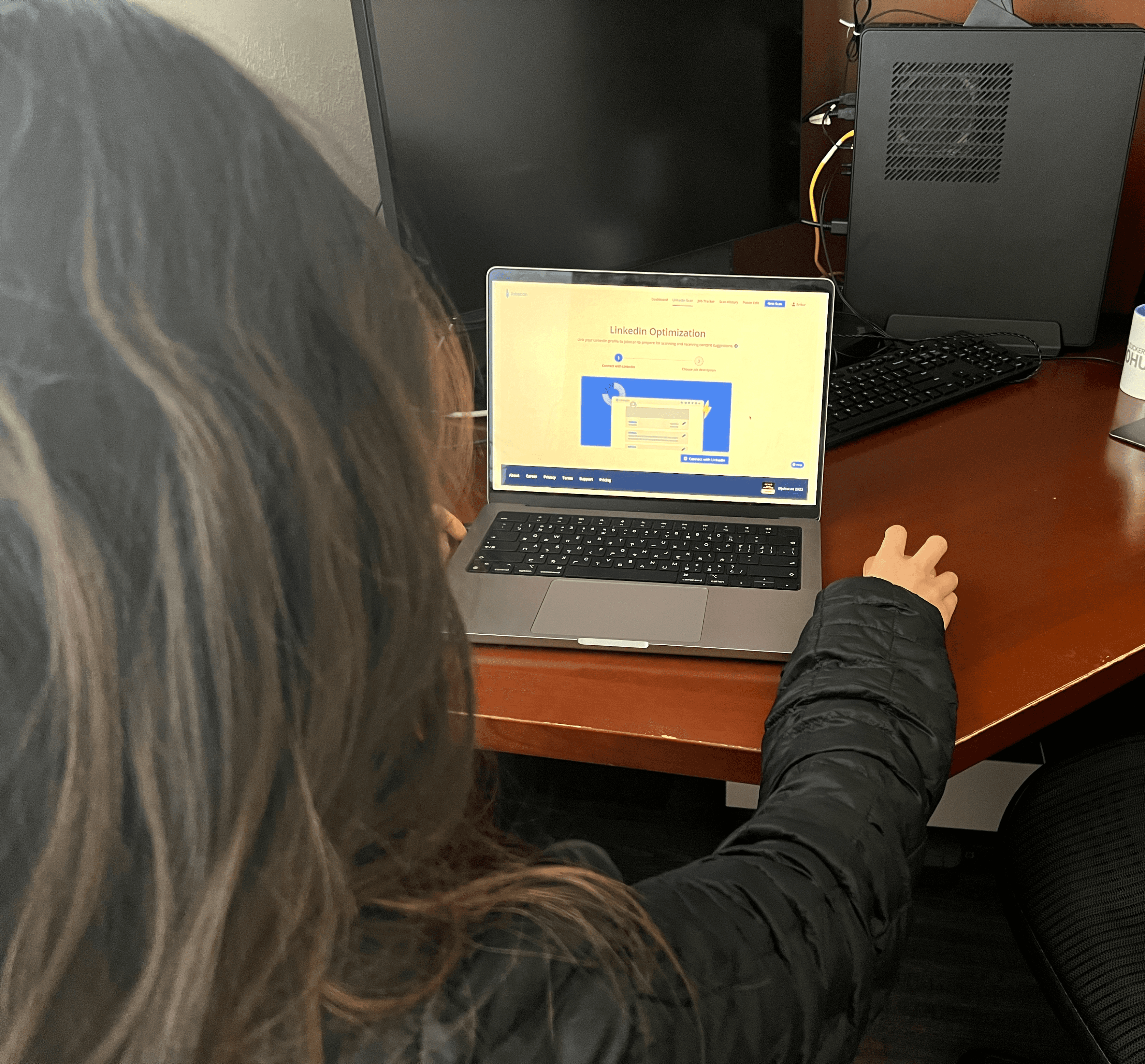
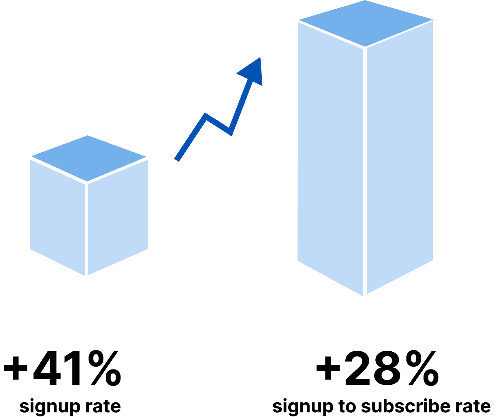
After the launch, Jobscan monitored monthly KPIs for signup rate and subscriber conversion rate.
One month after the redesign, the signup rate increased by 41% and the conversion rate increased by 28%
I feel pretty satisfied with the user testing feedback and metric results with my new design.
It was challenge at first time to redesign the system, but ideas gain much clear after understand user's pain points with Guerrilla Usability Testing.
Although it was a small flow redesign, it makes a big impact on the company's business growth.