
#web
#RWD
#accessibility
Streamline complex CPF content to make Singapore’s savings and pension plan clear and easy to understand for users. I led user research, redesigned the website, and built a design system from scratch.

UI & design system
6 months
1 PM, 3 developers, 3 designers
2 researchers, 2 UX writers
Information overloaded, less task-oriented.
UI and component doesn't reflect modern design practices.
The website is difficult to navigate, making it hard for users to find to what they're searching for.
Redesigned complex CPF content into a straightforward, responsive website through user testing and continuous iteration, ensuring clarity for a diverse user base.

The Central Provident Fund Board is a compulsory comprehensive savings and pension plan for working Singaporeans and permanent residents primarily to fund their retirement, healthcare, education and housing needs in Singapore.


We interviewed 60 CPF members of different age range. Afterwards, we came out with the 6 personas for design ideations.

Checking CPF's current website's Google Analytics data showed that most users will go to the homepage to use the common service and calculator tool as the first entry point from the landing page. Also from the interview, we understood that users usually have a specific task in mind to complete.
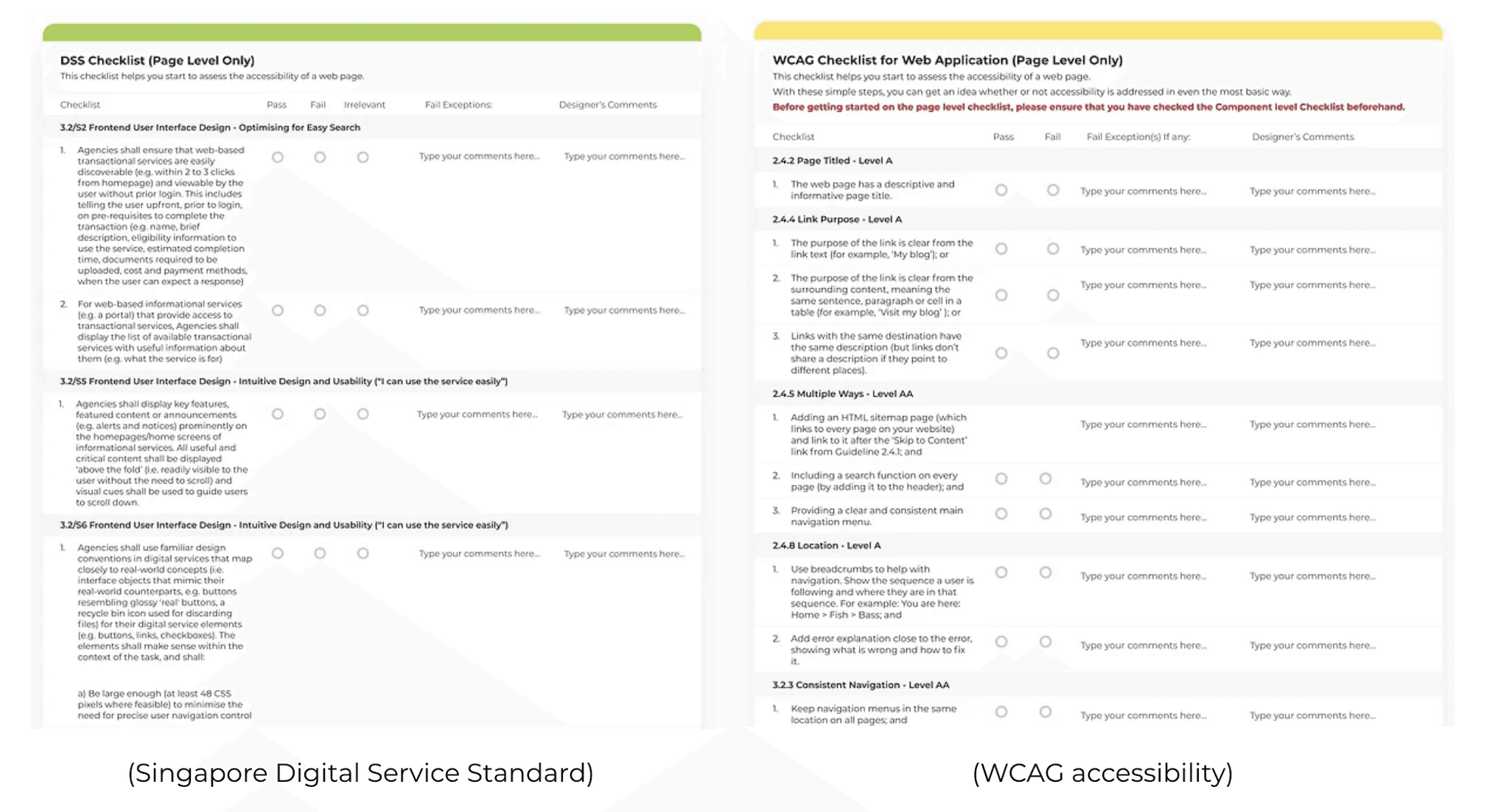
Apply DSS rule and apply WCAG rule to make it more accessible to all users. And follow the mobile-first principle while designing the mobile web.
1
Keep it relevant
Prioritise the information which is relevant to users.
2
Help users focus
Highlight the key information, so users can focus on what they need.
3
Be forthcoming
Allow users to make easier choices and control how they interact with a website.
4
Keep it simple
Present the information in an easy to understand manner.
1
Illustration oriented
Apply illustration to the website to show the brand value; its storytelling helps users understand it. The style becomes young and interactive with users. A hero image with illustration conveys the brand value so users will engage with us.
2
Prioritised content
The content will be three part to help users focus on and digest the content according to priority.
The primary content shows brand value and lets users use filter search to find what they need for task oriented purposes.
The secondary content introduces the main scheme to users, so users can keep exploring more about CPF.
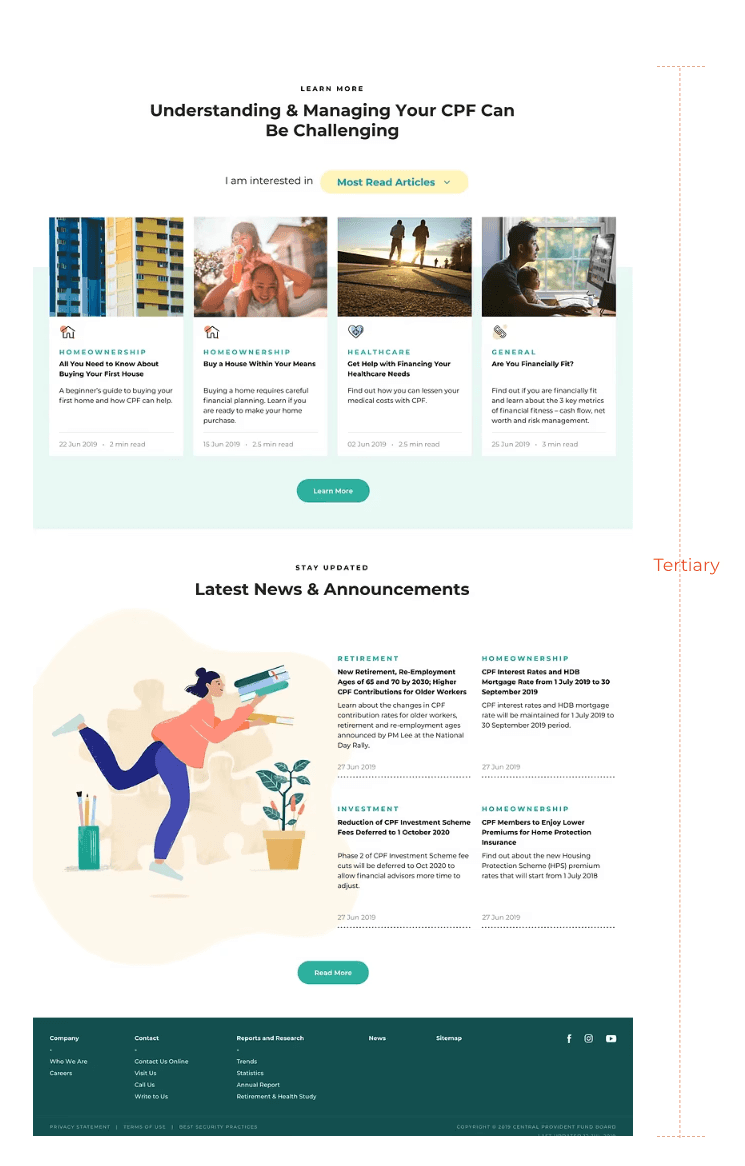
The tertiary content shows additional information to users like recommended reading and the latest news.

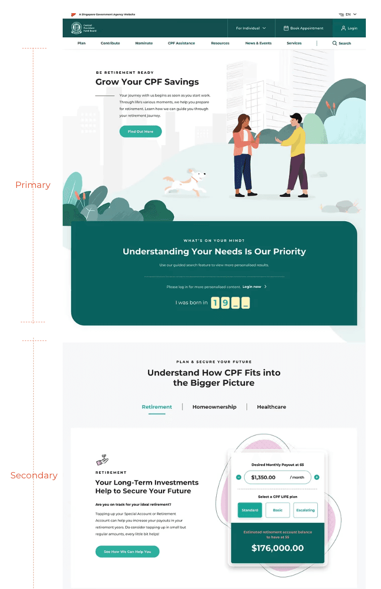
Users like content relevant to them. With the personalised filter they will see search results based on their needs.
We apply the design principle: keep it relevant.

This part introduces the 3 main CPF schemes, they can use the tab to easily switch to different schemes.
With a calculator tool, users can understand the scheme more by trying different numbers, and make a more informed decision on the right plan.
Apply the design principle "be forthcoming" so users can better interact and digest.

After a usability test with 20 CPF members, users are satisfied with the new homepage. They think it has a more modern style and it's convenient to find the information with the filter.
With the calculator, it's easier to understand different plans and results. Overall, users think the redesigned version is more engaging and personalised.
Working on this government website project, I gained valuable experience with DSS rules and WCAG accessibility standards while translating user needs into innovative solutions, such as incorporating a prominent calculator.
I was involved from the initial design phase through user interviews, usability testing, and vendor collaboration.
This experience taught me how to effectively manage design work and adapt features, like refining dropdown keywords, to enhance usability. The next step is to simplify filters and conduct further usability testing for design improvements

