Design a perpetual DEX that pro traders trust in the first thirty seconds

- Margin Trade is a perpetuals exchange you trade straight from your own wallet: no account, no KYC. One screen covers crypto (BTC, ETH, SOL at up to 20×), commodities (gold, silver, oil) and 24/7 synthetic perps on stocks like NVDA and TSLA, all margined in USDC and matched on a central limit order book. Built by Solayer on Solana.
Traders tried it once and went back.
The exchange worked. Pro traders opened it, placed one order, and returned to the centralized exchange they already knew. Nothing was broken enough to report, and nothing was good enough to stay for.
People who keep three venues open, read a book at a glance and size a position by muscle memory. Switching to us cost them nothing, and switching back cost them nothing either.
A marketing-site grid that wasted a wide monitor. An order button that greyed out without saying why. Risk settings hidden in a table after the trade. An explorer that was rows of raw data with no hierarchy.
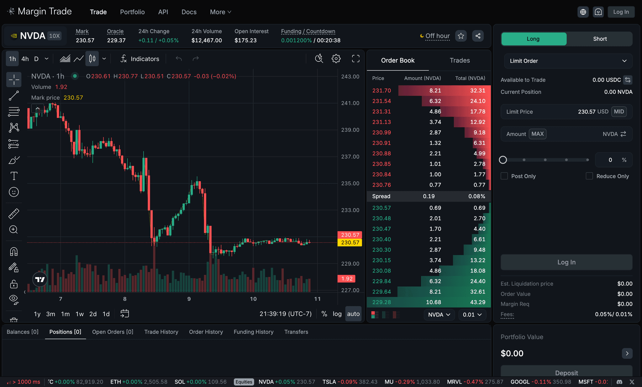
Most perp DEXs copy a CEX screen. We designed for depth: a packed layout you read without moving your eyes, an order form that never fails silently, and risk set before you commit. One layout for crypto and equities, from your own wallet.
Don’t make it prettier. Make it faster to be right.
The notes I left on the file: “make the interface more packed,” and on the explorer, “flat data misleads relationships; false mapping; no hierarchy; data, not insight.”
Kraken’s redesign expands one order ticket from beginner to pro; Hyperliquid mirrors a CEX and lets you drag orders on the chart. Both solve breadth. We had one audience, so we solved depth.
Two tests: can a trader see what they need without moving their eyes, and does the product ever fail silently? If a change didn’t pass both, it didn’t ship.
A book liquid enough that serious traders come back, on a product that works beyond one region and one asset class. Those two became the numbers we measured at the end.
Perps and spot on one layout.
Chart, book and form side by side.
Staged states, no silent disable.
TP/SL, mark price, liquidation before commit.
API wallet, explorer, brand, QA.
One trade page for perps and spot.
The first thing a pro noticed was that we had two screens for one job.

The Figma page “Trade (perp + spot)” is where this round lives. Traders held both kinds of positions, and the first build made them relearn the screen each time they switched.
One trade layout. The market picker changes the data and the controls, never the position of the chart, the book or the form.
Spot traders see leverage controls they never touch. Why I accepted it: we hide them per market type rather than split the page, because a stable layout is worth more to a pro than a tidier one.
Once perps and spot shared a page, the loose grid was the obvious problem: the book showed too few levels and positions sat below the fold.
Pack the interface.
Pros sit at wide monitors. The first build spent that width on margins.
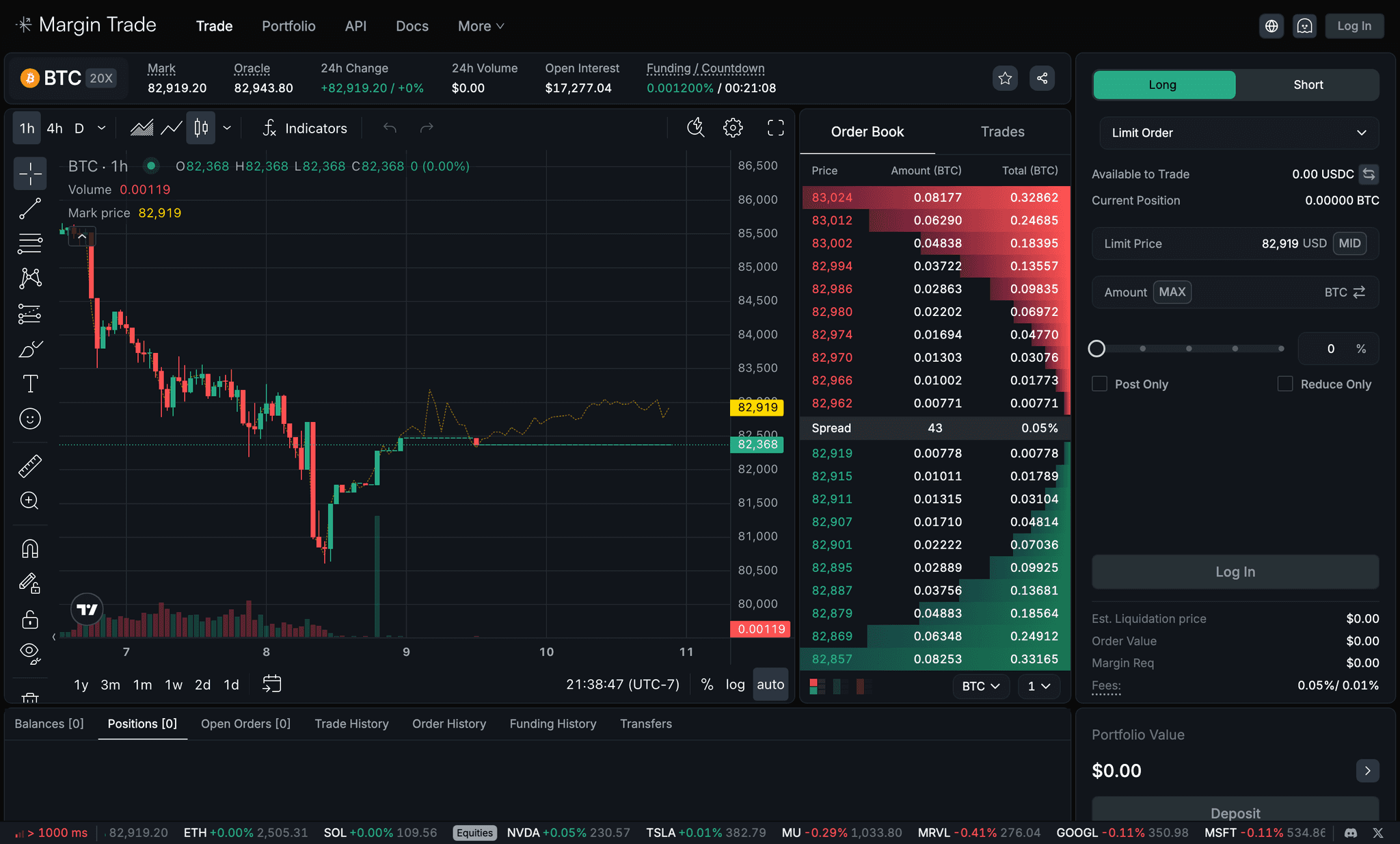
My audit notes: “make the interface more packed” and “redesign page dimensions.” The order book showed a handful of levels and positions needed a scroll.
A 1440 grid with the chart, the order book and the order form in one row, the account tabs underneath. Twenty book levels, the spread in the middle, every number in a tabular digit style so columns line up.
Density costs new traders: smaller targets, more on screen at once. Why I accepted it: the audience was pros, and a pro reads a packed screen faster than a spaced one.
The layout was now right. The order form still failed silently.
An order form that explains itself.
A rejected order is the moment a pro closes the tab. Ours rejected without a word.
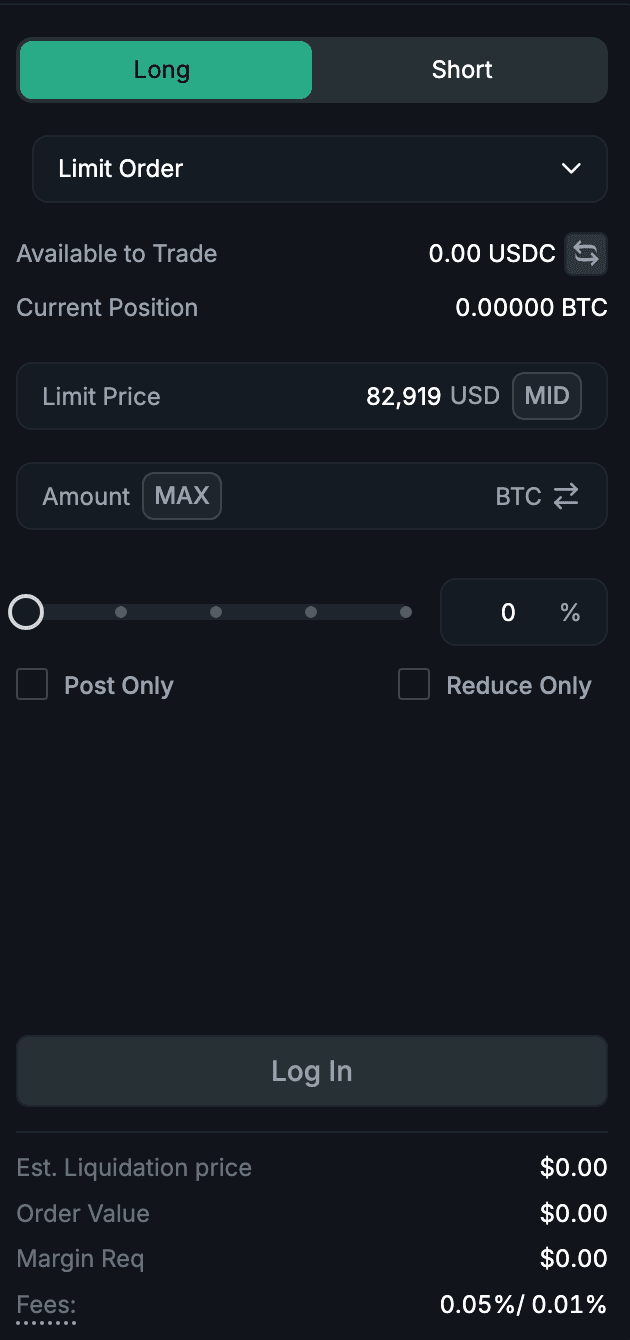

The round is a set of Figma frames named for each state: “Disable before entering amount,” “Limit price,” “Take Profit price,” “Place Order button, currently disabled,” and a note that error states had to match across screens.
Stage the form. Before an amount, the button is disabled and the field says so; MID fills the limit price, MAX fills the amount. Liquidation price, order value, margin and fees appear before you commit, not after.
More states means more to build for five engineers, and the form got taller. Why I accepted it: guardrails that explain themselves are cheaper than a lost trader.
Orders went through. The next question was what happens after: how a trader protects the position.
Risk where the decision happens.
Pros set their exits when they enter. We made them do it afterwards, from a table.
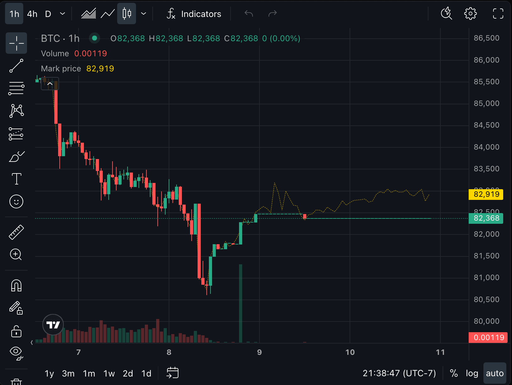
Figma frames “Add Mark Price Line” and the “Position TP/SL” series. A form that made traders set exits afterwards was a form they didn’t trust.
Take profit and stop loss live inside the order form, with a Take Profit + Stop Loss toggle. The mark price is drawn on the chart in yellow, and the estimated liquidation price is shown with the order cost.
Two more fields on an already dense form, and a chart line that competes with the candles. Why I accepted it: liquidation is the one surprise a trader never forgives, so the information earns its space.
Trading worked. What was left were the reasons a pro wouldn’t move size to a new venue: can I automate it, and can I verify it?
Trust layers, then launch.
Size follows trust. The last round was the parts of the product that prove it is telling the truth.
The explorer audit note in the file: rows aligned left and right read as one-to-one pairs when they weren’t, and blocks and transactions sat on one plane. The API wallet flow has its own annotated frames.
The explorer got a hierarchy: a block contains its transactions, a user is the actor. The API wallet flow only enables Authorize after the wallet is named, so nobody signs for something they can’t identify.
The authorize step adds a screen; hierarchy costs horizontal space. Why I accepted it: both are places where speed would cost trust, and for size, trust wins.
The last pages of the file are the launch: the Margin Trade name and logo, the brand color pass, a Day 1 page, a QA issues page, and a mobile trade view with a second designer. Mobile shipped as a trimmed trade screen, not parity. Why: the date mattered more than a second full layout.
Dark, dense, one green.
Near-black surfaces, tabular digits, and color used only to mean something: green for long and bids, red for short and asks, yellow for mark price.
A Digits text style with tabular figures for every number, so price columns stay aligned as they tick. Color never decorates: if it’s green it’s long or a bid, if it’s red it’s short or an ask.
A dark, three-color system leaves little room for emphasis. Hierarchy has to come from size, weight and position, which is slower to design but faster to read.
A venue traders moved size to.
The founder asked for two things: a liquid book, and a product that works beyond one region. Both landed.
Perps and spot, crypto and equities, on one layout.
Traders beyond one region, on a product built by seven people.
Five design rounds, each one closing the biggest reason a pro would leave.
What I learned, and what I’d do next.
Every round that worked removed a page, a scroll or a guess. None added a feature.
In a trading UI, the disabled button and the error are where trust is won or lost.
The authorize step slows people down on purpose. Pros read that as care, not cost.
Order-fail rate and time-to-first-order per release, so each iteration has its own before and after instead of one outcome at the end.
Session recordings on the order form and the book under live market conditions, to find the eye movements the layout still costs.
The launch mobile view is a trimmed trade screen. A real second layout for positions and risk is the next design problem.