Turning a crypto wallet into a card people sign up for
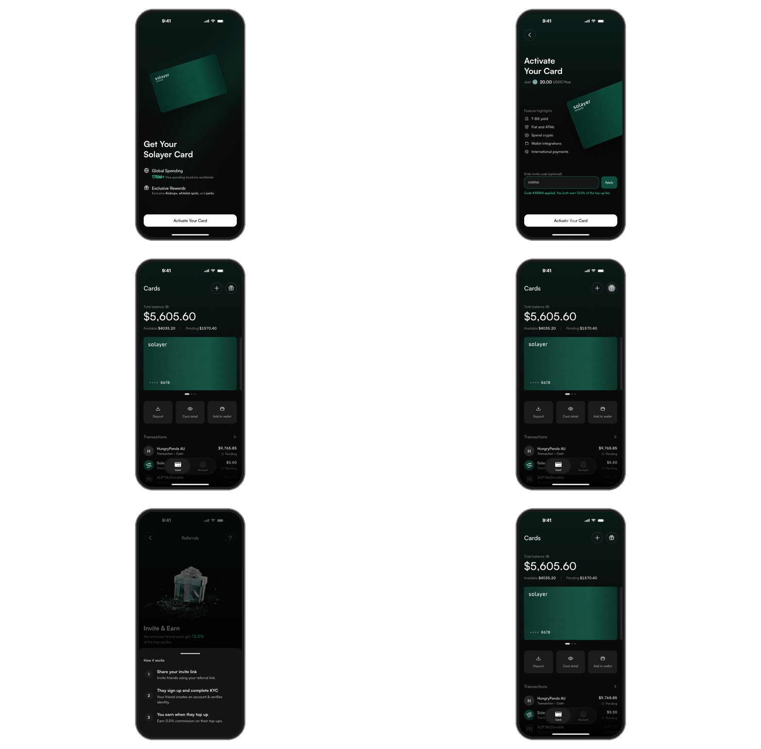
Too few people signed up, and too little was spent. I redesigned Solayer Pay from a wallet with a card attached into a card-first app, raising the sign-up rate by 38% and spending volume by 25%.
People downloaded a wallet. They didn’t sign up for one.
Version 1 asked for commitment before showing any value. The card, the one reason a non-trader would join, was a tab away.


The first screen never answered “why sign up?”
Country check, $20 fee, KYC and a deposit came before the card.
No reason to spend today, or to tell a friend.
Add a user quote on why they didn’t sign up.
Add the starting sign-up rate.
Nobody signs up for a wallet. They sign up for what their money can do.
Show the card before asking for anything.
KYC and money only once people want the card.
Spending and inviting should reward each other.
Five rounds. Each one fixed a step in the funnel.
You and a friend each earn 12.5% of the top-up fee.
The wallet tab is gone. The card is the app.
Clear states for country, payment and KYC.
An info icon explains the $0.30 fee.
A gift on the card home: invite and claim in one tap.
A warmer first impression, the same wallet underneath.
Rewards on the welcome screen, passkeys, a card banner, and our first referral program. Better screens, same structure.


A reason to download, and a reason to top up: the reward grows with what the friend adds.
Keep the wallet; improve the way in and add referrals.
Fast to ship, but the card stayed an upsell behind a fee and KYC.
Polish couldn’t move the card out from behind the wallet. Next: change the structure.
We cut the wallet tab and made the card the app.
The turning point, and a hard call for a crypto company. Two tabs, Home and Account, and sign-up leads straight to the card.


Remove the wallet tab; Home is the card.
Crypto-native users lost a home for send and receive.
The happy path was short, but country, payment and KYC failures still dead-ended.
No dead ends, and no fee shock.
Every failure state got a clear next step. And instead of a bare fee line, an info icon explains small-purchase fees in plain words.


Design every failure state; explain the fee with progressive disclosure.
The fee is one tap away, so the icon sits beside the amount and the modal states it exactly.
Referrals from round 2 still sat in a corner. The final round made them a loop.
A card worth signing up for.
Card first, no dead ends, and a gift on the home screen that turns spenders into the acquisition channel.


Solves “no reason to join.”
Solves “commitment before reward.”
Solves “nothing to come back for.”
Sharing 12.5% of the fee costs revenue per referral, in exchange for growth from people who already spend.
Add a user quote and a test result from the final prototype.
More people signing up, and spending more
More downloads became accounts once the card led the app.
More spent on the card after the redesign.
The card became the product.
What I’d tell my past self
Round 2 polished screens. Round 3 moved one tab and changed the product.
Failures decide whether a sign-up becomes a customer.
Activation and the gift had to feel rewarding, so I built them in code.

