Turn a pro trading terminal into a three-tap app, without losing a single function
- Simple mode is the mobile face of Margin Trade. Same perpetuals, same margin, TP/SL and leaderboard as the 1440px terminal, reorganised into four tabs and one Buy / Sell bar, with Advanced mode one switch away. Nothing was removed; everything the terminal does is still there, one layer down.
The terminal is right for pros and wrong for everyone else.
Pro traders moved size to the desktop terminal. But most people who open an exchange are not pros: they arrive on a phone, from a simple app, and want to trade fast. Here is what the terminal gave them.
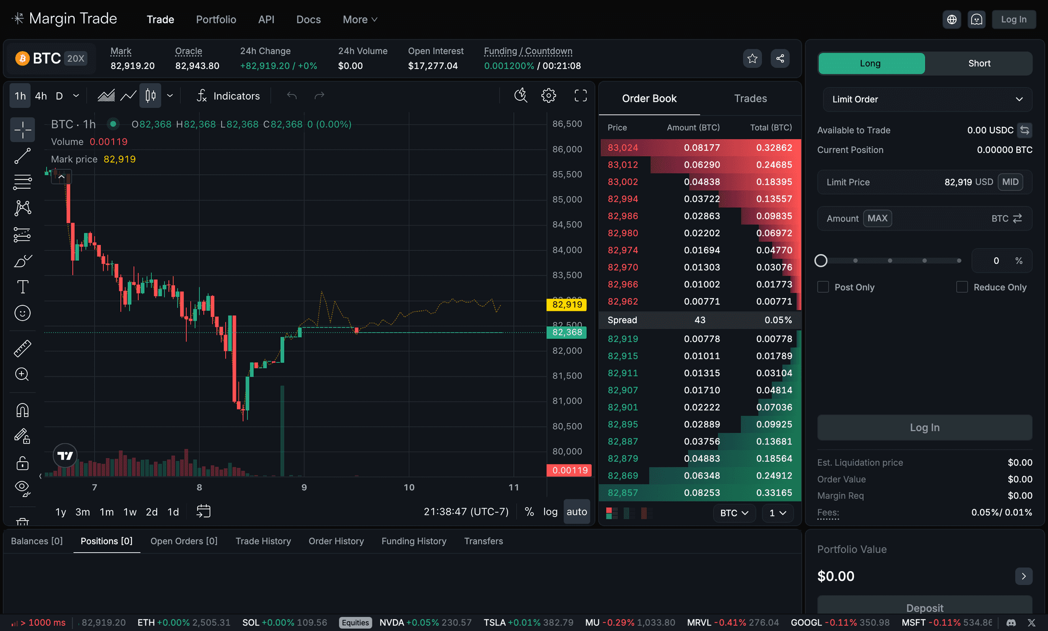
Counted on the live BTC page: chart tools, book, form, tabs, ticker. All on at once.
Side, type, price, amount, leverage, flags, then a button that greys out without saying why.
On a phone the layout overflows sideways: the form is cut off and nothing is primary.
Trade with confidence in three taps, and never lose the terminal.
More people who start an order finish it.
Less time in the flow, fewer rejected orders.
A first trade on day one, and a reason to come back.
Fees, margin and liquidation shown before anyone confirms.
Advanced mode, the full terminal, one switch away on the same account.
Same tokens, digits and colors in both modes, so switching feels like scrolling.
What the market and the references told us.
We had no analytics on a mode that did not exist yet, so the evidence came from three places: public data on where perps are going, published research on simple trading apps, and the apps our target users already had on their phones.
On-chain perpetuals are no longer a niche: decentralized perp venues took about 26% of crypto futures volume by early 2026 (BEX), and the category cleared $633B in a 30-day window this October (DefiLlama via Pixel). The pro segment is already contested: Hyperliquid alone holds roughly 31% of perp DEX volume. New volume for a smaller venue has to come from new traders.
A 2026 Washington State University study of Robinhood users found they choose stocks by simplicity, favouring names and categories they already understand (WSU). Coinbase and Robinhood together onboard tens of millions of people on one pattern: a balance you understand at a glance, one list of assets, one big button (Business of Apps). That is the mental model our next trader brings.
Industry write-ups put first-transaction drop-off in crypto apps between 60% and 75% (Swapper); Stripe reports platforms losing up to 70% at identity verification (Stripe). Vendor figures, so we treated them as direction, not fact. The direction was clear: every screen before the first trade costs users, and we had no KYC to lose them on, so the screens were ours to cut.
We pinned Coinbase’s home and buy flow next to Hyperliquid, Jupiter and Raydium’s mobile perps. The perp apps shrink the terminal; Coinbase gives you a balance, a chart, a list and a keypad. We took Coinbase’s structure, the Solayer Pay system for surfaces, spacing and components (glass cards, a floating tab bar, pill buttons), and Margin Trade’s colors, so a trader moving between modes sees one product.
Hide the terminal. Don’t remove it.
Four jobs a trader does. Each one, the old way and the new way.
The same person, the same four intentions. The terminal row is what they had to do on a phone; the simple-mode row is what they do now, and why we changed it.
In research, the first intention on opening a trading app is orientation, not an order: the WSU study on simplicity-first investors, and our own feedback, both say people check a balance and a familiar list before they trade. The terminal opens on the one market you looked at last and hides the account under the chart, so simple mode opens on the account and puts markets under it.
New traders think in dollars at risk, not contract size, and they abandon when a form asks for things they don’t understand: that is the 60–75% first-transaction drop-off in the research, and success metric 2 in our brief. So the sheet opens on an amount, and leverage, margin mode, time-in-force and TP/SL become chips: a pro opens them, a first-timer ignores them, and the button is never disabled without a reason.
Users told us they wanted control, and control starts with knowing what a trade costs and where it dies. Success metric 4 made it a rule: fees, margin and the liquidation price are on the preview, in the terminal’s mark yellow, before the fill, and the confirmation sets the liquidation alert for you. The order book, which pros read for depth, moves one tap behind the market instead of sitting between a new trader and the button.
Success metric 3 is retention, and a terminal only rewards you when you trade. Simple mode gives two reasons to open it with no order to place: a daily change on your own equity, and a leaderboard with your rank pinned and a share sheet behind it, which is also the only viral loop the product has.
Three screens, and the data behind each change.

Each pair shows the terminal as it renders on a phone today, the simple-mode screen that replaces it, and the evidence that drove the decision.

The first screen is a chart you can’t read and an order form that is cut off. There is no balance, no list of markets, and the primary action is below the fold. Pros tolerated it; new traders left.
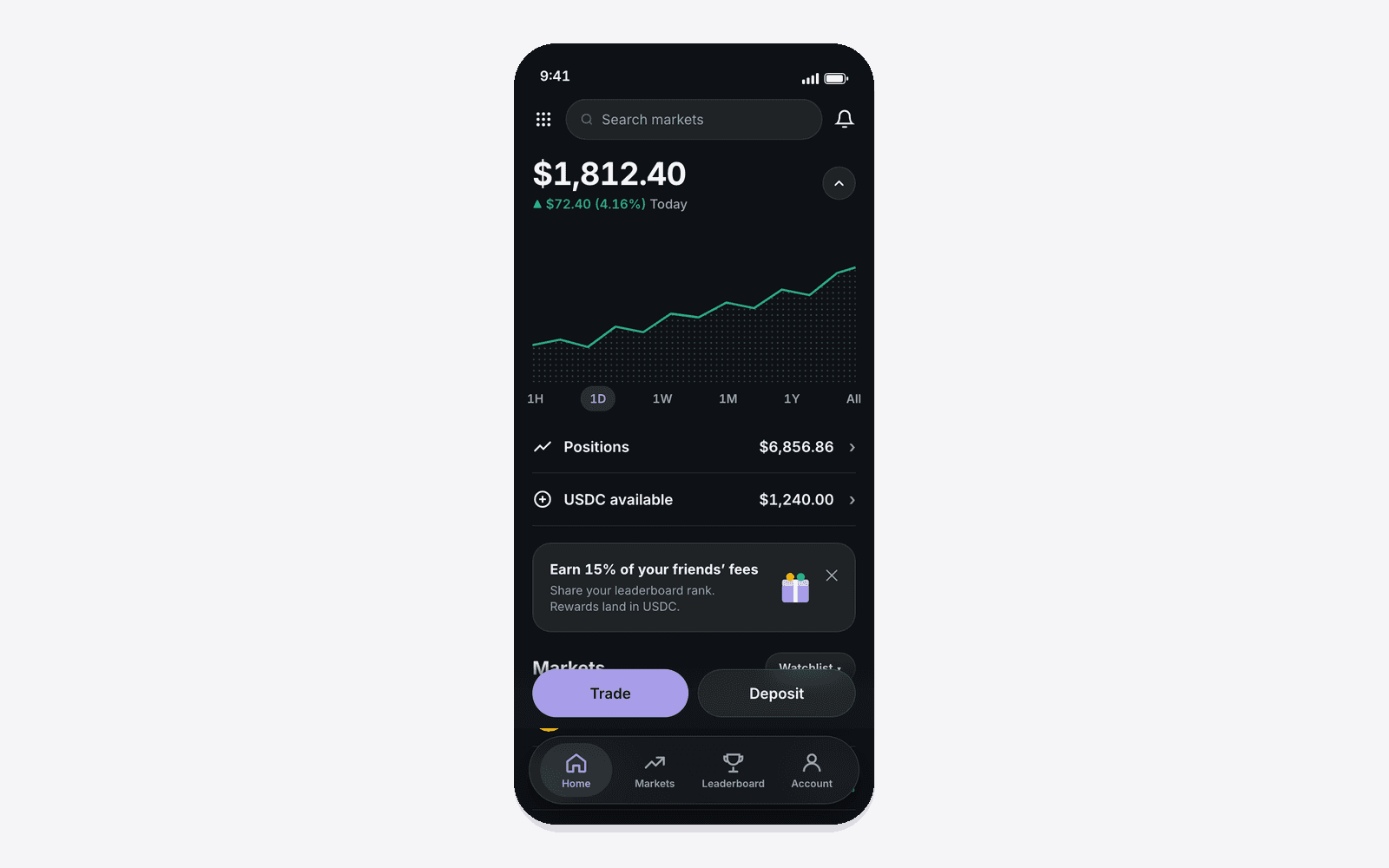
One number you understand, a chart under it, two rows (positions, USDC), then markets with sparklines and a floating Trade / Deposit bar. Why: the user intention on opening the app is “how am I doing, and what is moving”, not “place an order”. The WSU study on simplicity-first investors and our own feedback both point the same way: people orient on a balance and a familiar list before they trade.

Side, order type, price, MID, amount, MAX, leverage, post-only, reduce-only, then the button. Every control is visible whether you need it or not, and the button is disabled without saying why.

Type what you want to risk, see the size in BTC, tap Preview. Leverage, margin mode, time-in-force and TP/SL are chips a pro can open and a first-timer can ignore. Why: in research, new traders think in dollars at risk, not contract size, and they abandon when a form asks for things they don’t understand (the 60–75% first-transaction drop-off). Success metric 2: fewer steps, fewer errors. The three-tap path stays three taps.

On the terminal, liquidation price, margin and fees sit in small grey text under the button, and the order book is always on screen. New traders confirmed trades without ever reading them.
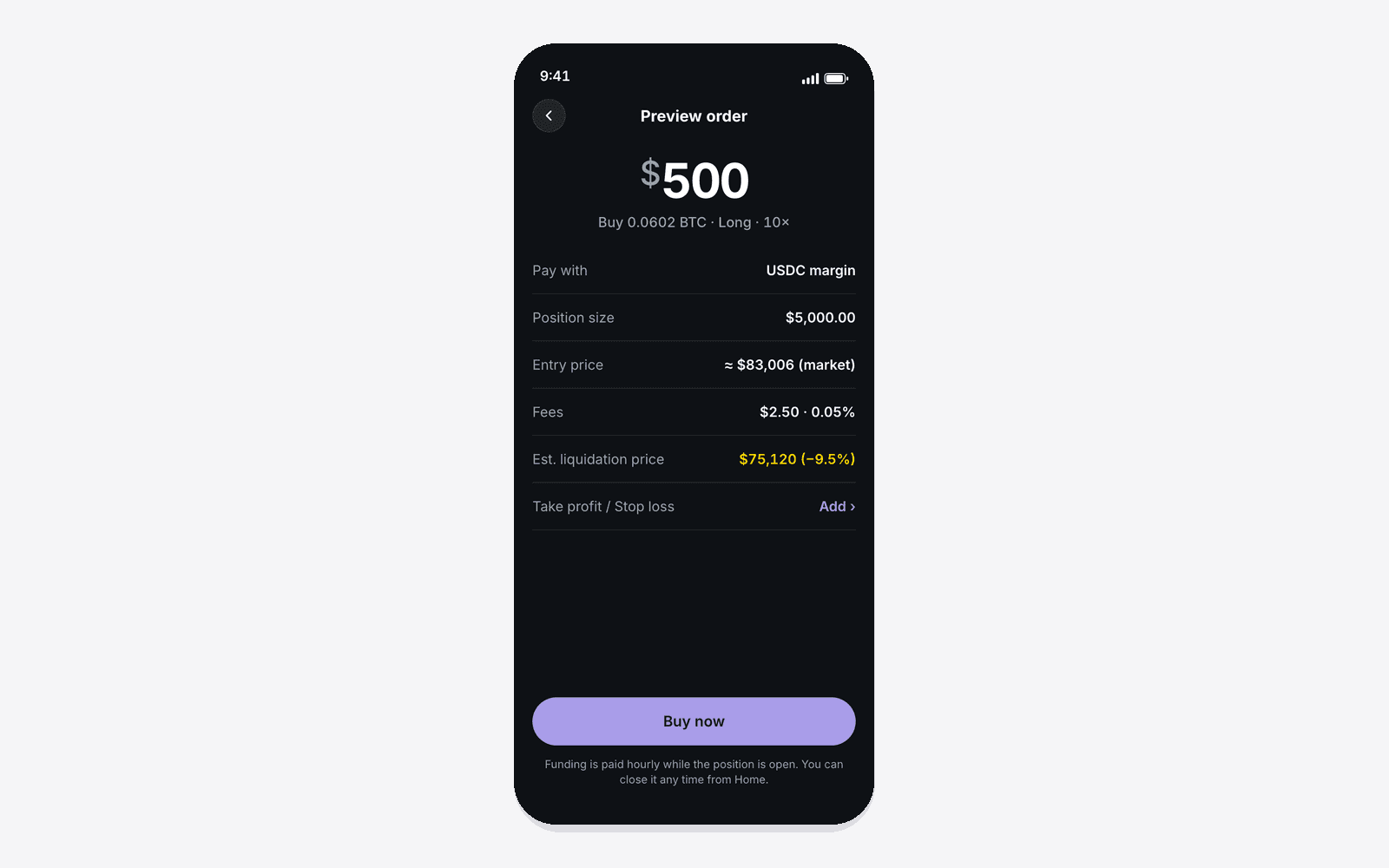
One preview step before the fill: position size, entry, fees, liquidation price in the terminal’s mark yellow, and a TP/SL row, all before Buy now. The order book moves one tap behind the market. Why: users told us they wanted control, and control starts with knowing what a trade costs and where it dies. Success metric 4, understand cost and risk before confirming, and the founder’s rule that nothing fails silently.
Coinbase’s structure, Solayer’s surfaces, Margin Trade’s colors.
Four tabs, one trade flow, one switch to the full terminal. Glass cards on a near-black page, a floating tab bar, pill buttons, Inter with tabular digits. Lavender for every action and highlight; green for long, red for short, yellow for mark and liquidation.

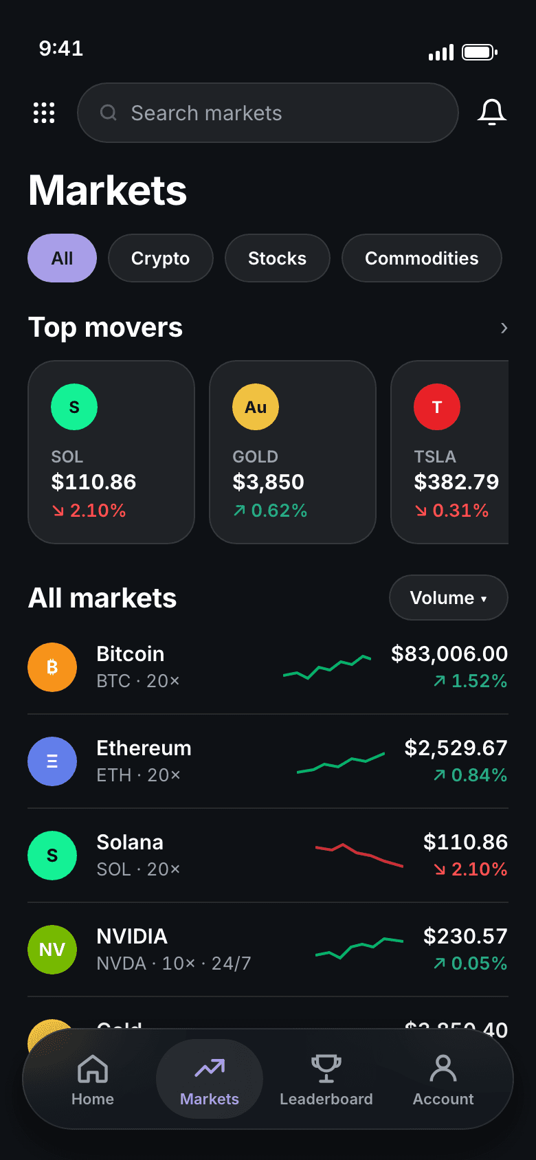
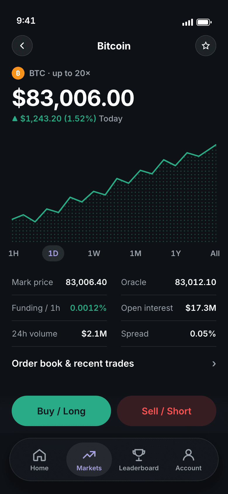


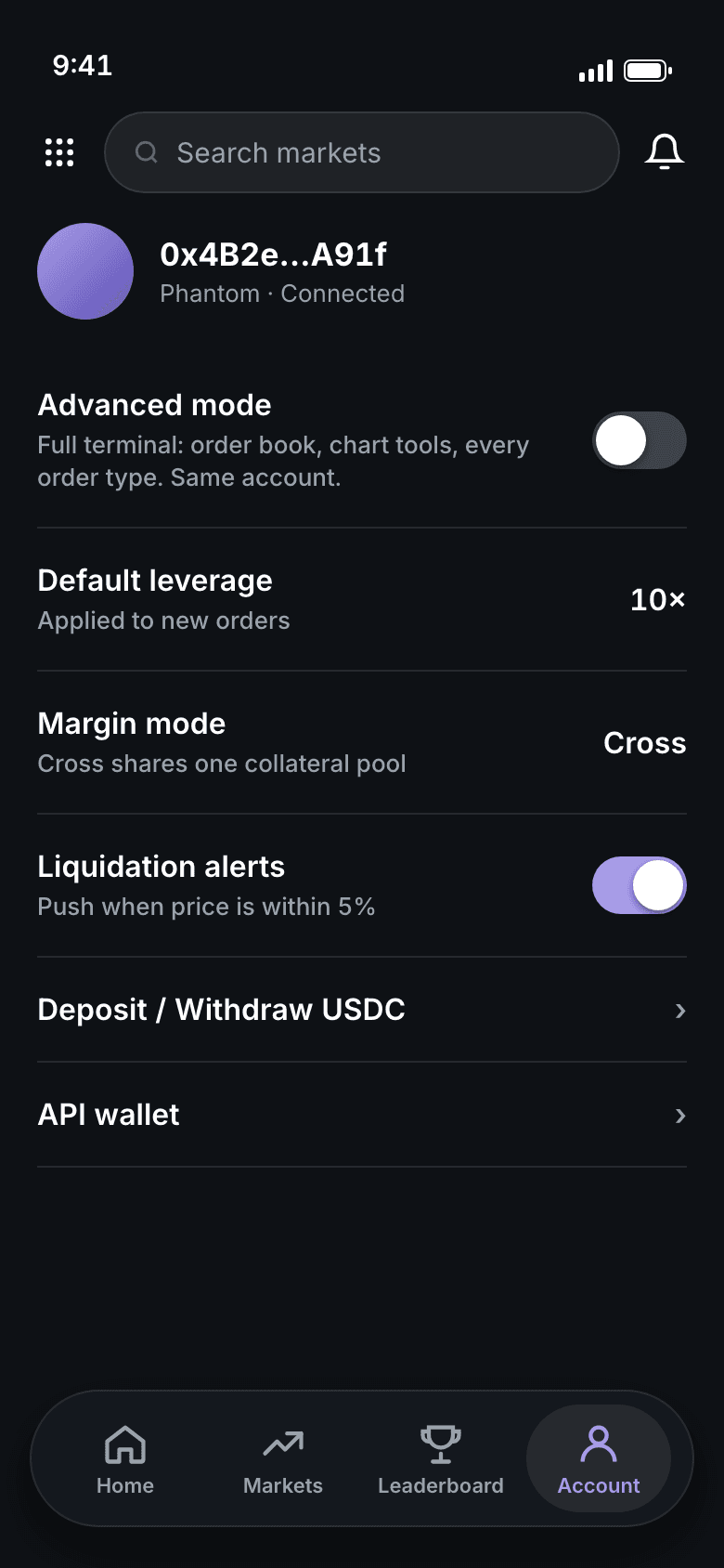
Counted on the live BTC page and on the simple-mode home: a search, four tabs and one bar.
Buy / Long, amount, Buy now. Everything else is a chip you can ignore.
Leverage, margin mode, time-in-force, TP/SL, book, trades, history: all present, one layer down, and Advanced mode one switch away.
Five calls, and what each one cost.
Coinbase’s home, list and keypad are the most-learned patterns in consumer finance, so we used them as-is. The surfaces, spacing and components come from the Solayer Pay system we already had (glass cards, floating tab bar, pill buttons), in Margin Trade’s colors. Why: our traders move between simple and Advanced mode; the same dark page, digits and colors make that one product, not two. Cost: a dark consumer app reads heavier than Coinbase; we bought back lightness with space, translucency and one accent per screen.
Coinbase has Buy & sell and Transfer. We kept Buy / Long in green and Sell / Short in a red tint on every market, the only two buttons that are not lavender. Why: a perp trader shorts as often as they long, and a single button would hide half the product behind a toggle; direction has to be legible at a glance. Cost: the bar is taller and the tab row sits lower.
The order sheet opens on a keypad. Leverage, margin mode and time-in-force are chips you can tap or ignore; TP/SL is one row. Why: success metric 2; the three-tap path stays three taps for new traders while a pro can still set every parameter. Cost: defaults carry weight, so they match the terminal’s defaults exactly.
Fees, margin, entry and the liquidation price sit on the preview step, in the terminal’s mark yellow, not behind an info icon. Why: success metric 4. Cost: one more screen between amount and fill; we kept it to one tap and no scrolling.
Advanced mode is the first row of Account: the full terminal on the same wallet and positions. Why: trying to serve pros and first-timers on one screen is how the terminal got to sixty controls. Cost: two surfaces to maintain, so both share one token set and one order engine.
Solayer’s surfaces, Margin Trade’s colors, at thumb size.
Glass cards at 7% white with a 10% hairline, a floating blurred tab bar, 999px pills, 48px rows and a 60px amount. Lavender Mist, the Margin Trade brand color, on every call to action and highlight; green and red kept only for long, short, gains and losses.
Surfaces are translucent, not painted: cards are a 7% white over the page with a 10% hairline, and the tab bar floats with a 22px blur, so the content shows through as you scroll. One accent, Lavender Mist, carries every action and selected state, so a trader never has to ask which thing on the screen is tappable. It is the Solayer Pay system, re-colored, which also meant engineers reused components instead of building a second set.
Blur and translucency cost GPU on older phones, and a dark system has less contrast headroom in sunlight. Both have a fallback: flat 7% surfaces with no blur, and a light variant in the file.
Three months in: more volume, and traders who feel in control.
Simple mode launched alongside the terminal. Three months later the team measured the change, and the feedback that came with it.
Three months after simple mode launched, measured against the terminal-only baseline.
Down from seven steps on the terminal.
Down from about sixty, with nothing removed.
The recurring theme in feedback was flexibility and control: a fast path for the everyday trade, and the full terminal one switch away when they wanted it. That is the exact tension the product goal set out to resolve.
Completion and speed: the three-tap path shipped as designed. Cost and risk: every preview shows fees, margin and liquidation. Activation and retention: the volume lift is the first signal; per-cohort activation is the next number we instrument.
Margin Trade clears $1M+ in daily volume with traders in 14+ countries. Simple mode is how that base grows beyond pros.
The competitor and onboarding figures in the research chapter shaped the brief; they are cited there and not counted as results. The +15% is the team’s own measurement.
What I learned, and what I’d do next.
The moment we listed every terminal function and gave each a home, the fear of ‘dumbing down’ went away.
Coinbase’s home and keypad translated; its white and blue did not. One system across both modes makes them feel like one product.
‘About sixty’ did more in the room than any adjective. Numbers you can count are the fastest way to align a founder.
Time to first order, order completion and error rate per cohort, so the next lift is attributable to a screen, not a quarter.
Hand them a phone with simple mode and a $20 position to open. Count the hesitations.
Learn which mode a trader uses per market and open there, so the switch becomes invisible.