
A calmer way to live with dialysis.
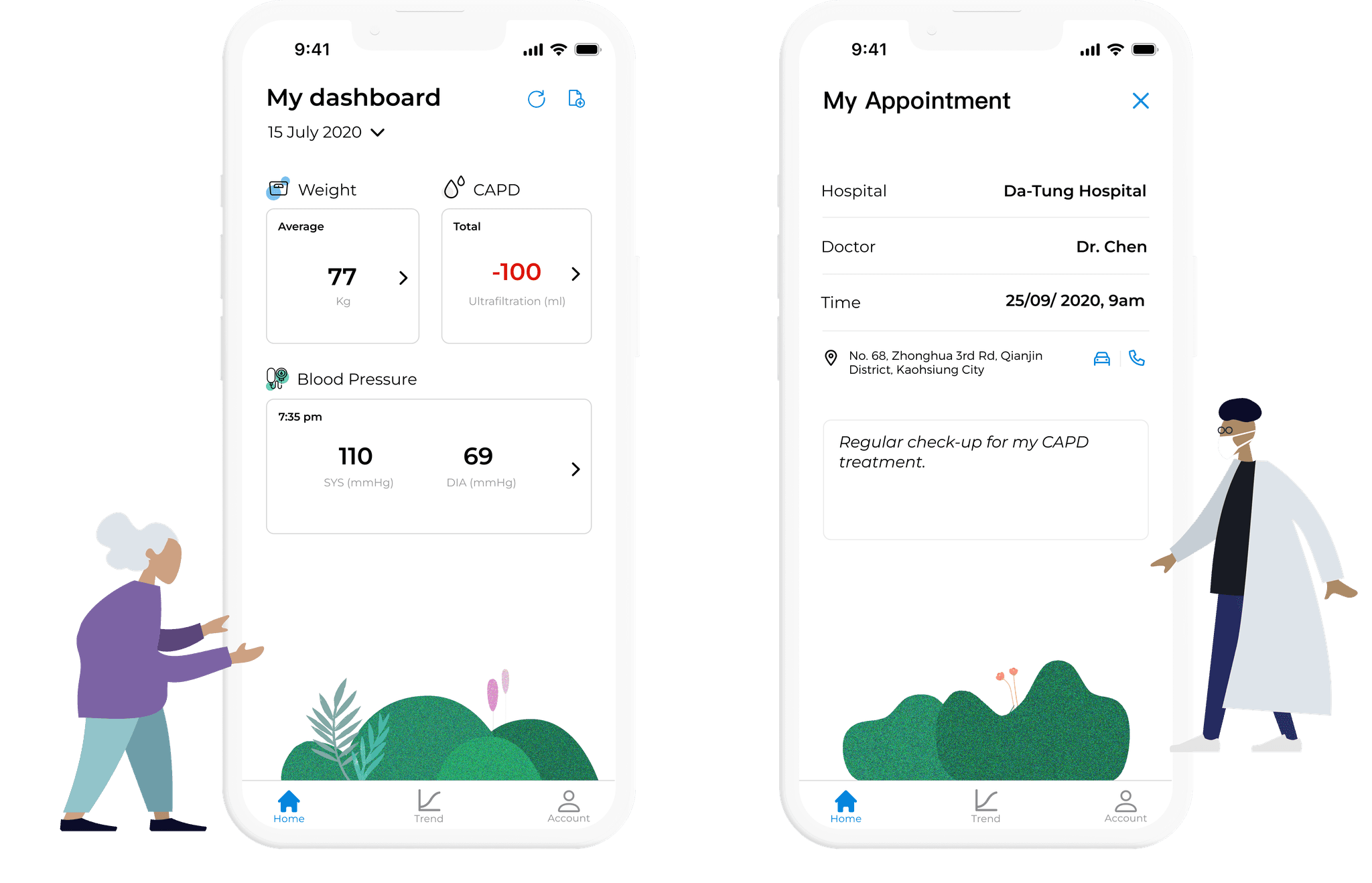
As founding designer, I took an App Store health app from research to launch and helped the startup raise $600K.
Four paper logs a day.
Home dialysis patients tracked their body data by hand. Their care teams couldn't see it between visits.

Slow to fill in, easy to forget, impossible to share.
Fluid, blood pressure and weight, four times a day.
Progress was hard to monitor remotely.
Phone calls and third-party apps filled the gap.
25 conversations with patients and clinicians.
Patients aged 40 to 80, and the people who care for them.
His illness changed his career. He wants to stay in control of his treatment.
- Clearer talks with his doctors.
- To feel in charge of his treatment.
- Logging data four times a day.
- Forgetting hospital check-ins.
Less logging. More living.
How might we help patients manage treatment more easily, while staying close to their care team?
No more manual entry.
Clinicians see progress as it happens.
Clear steps, fewer mistakes.
One sitemap. Three dashboards. One winner.
10 participants chose the third idea: a clear landing view with details one tap away.

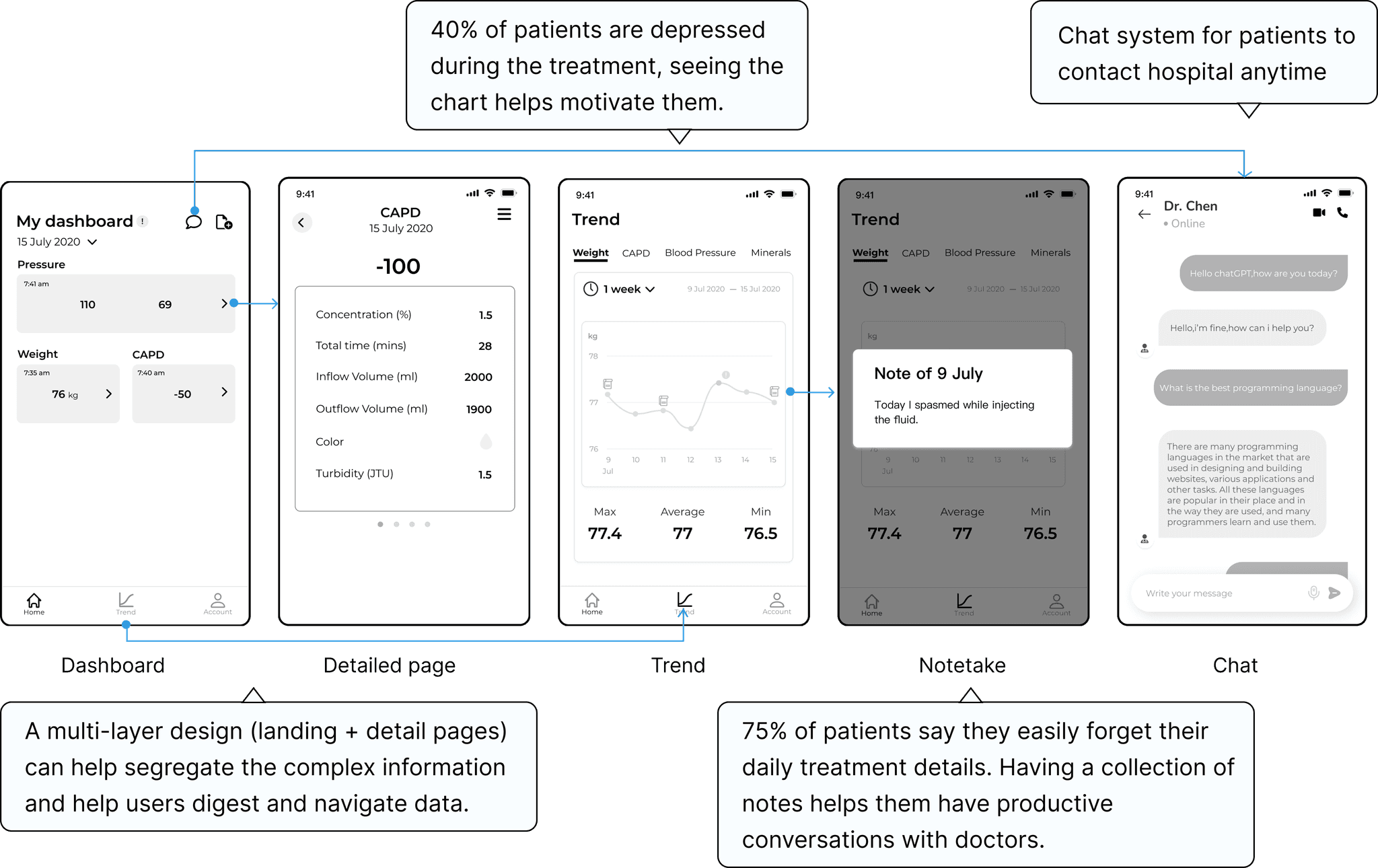
Your data. Your trends. Your care team.
One dashboard, clear trend charts and a direct chat with care providers.

Clearer with every test.
Tested with 10 users and checked against WCAG, so older patients read everything with ease.

A clear date picker, details on their own page, chat one tap away.

Tabs replaced a hidden dropdown.
Loved by patients. Trusted by clinicians.
Tested with 10 patients and 10 clinicians.
Patients finished all 5 tasks without errors.
Out of 10, for “Would you recommend it?”
Doctors and nurses felt the difference.
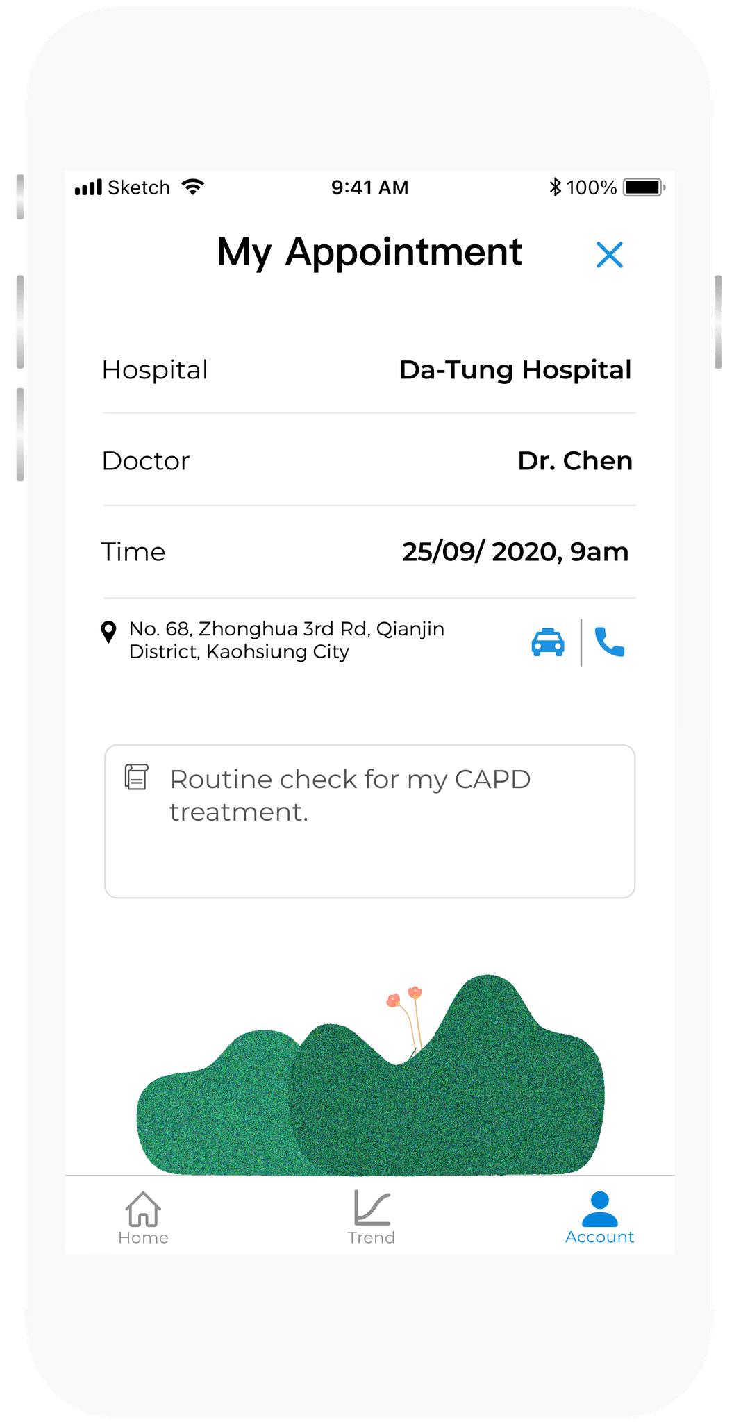
The hi-fi prototype.



Empathy is the work.
Friendlier empty states, a family mode for remote care and playful note-taking. Seeing patients take charge of their recovery taught me what design is for.

